Design Communication
Task 1 - Field trips of museum / exhibition spaces
1.A - Local public spaces
Fat Harry's
San Anton Gardens
O'reilly's Pub
Chinese Garden
Malta National Aquarium
Mosta Pride Public Garden
Skatepark
Break Water Valletta
St.Paul's Cathedral
Howard Gardens
San Anton Gardens
O'reilly's Pub
Chinese Garden
Malta National Aquarium
Mosta Pride Public Garden
Skatepark
Break Water Valletta
St.Paul's Cathedral
Howard Gardens
1.b - Museum / exhibition space
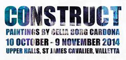
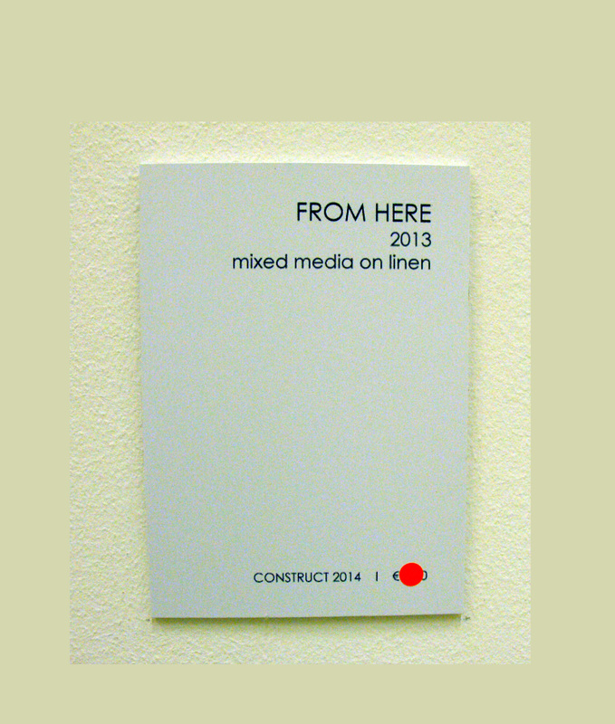
St James Cavalier - Construct Paintings by Celia Borg Cardona
Functional Considerations
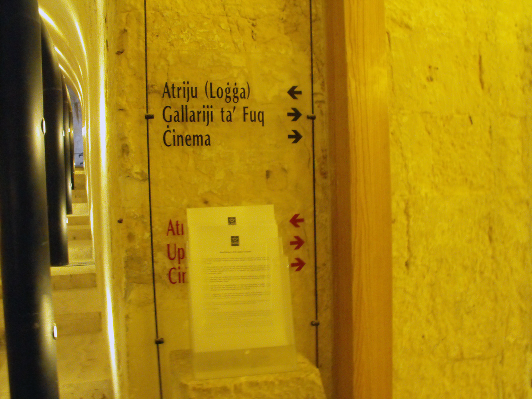
- Directional signs are not clear / understandable.
- In front of the English version sign there where papers which blocks that sign from seeing it.
- If you go on a busy day to see the exhibition you may bump to other people when going around to see the paintings.
- Name of the exhibition was clear as when you go up the stairs you will see a poster on your right.
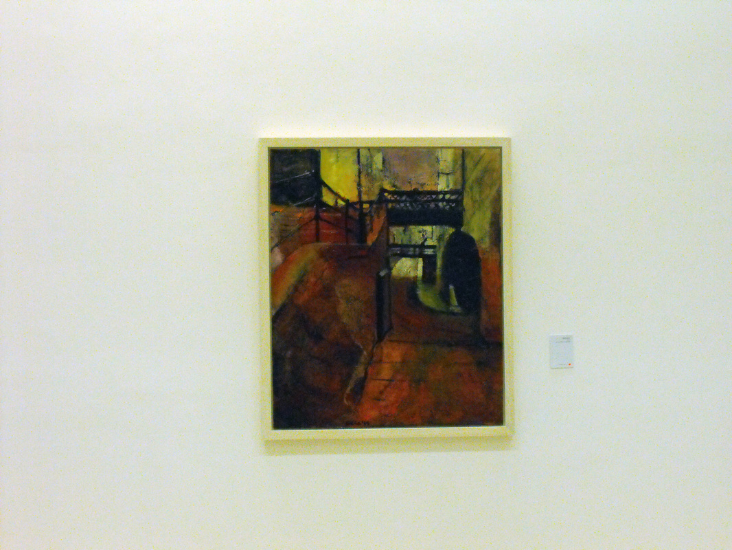
- Reading heights of the paintings not eye level.
- The reading about the exhibition was quite bold and placed well for people to read.
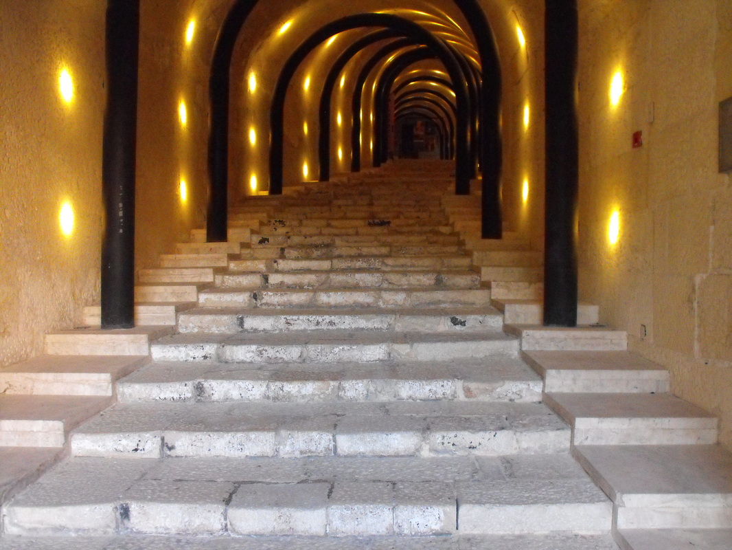
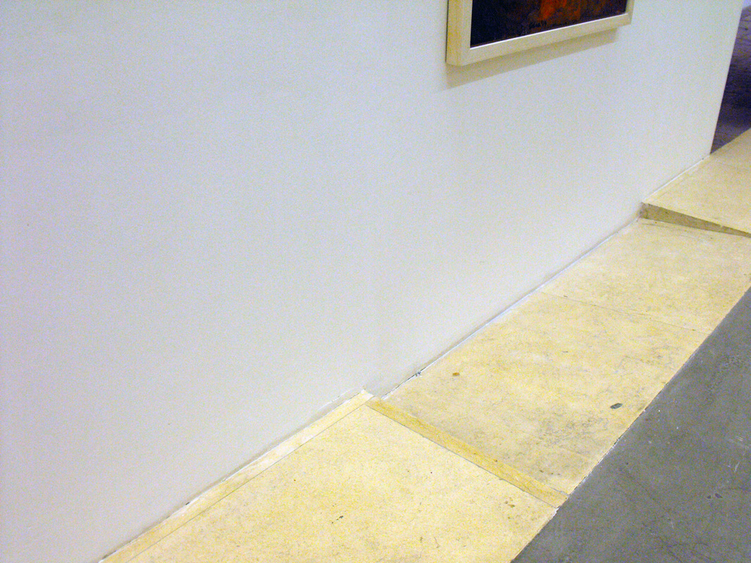
- There is no ramp outside St.James Cavalier for people with wheel chair that want to see the exhibition.
- Also one of the inside ramp was blocked.
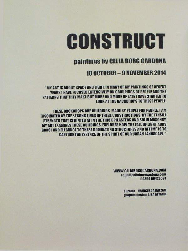
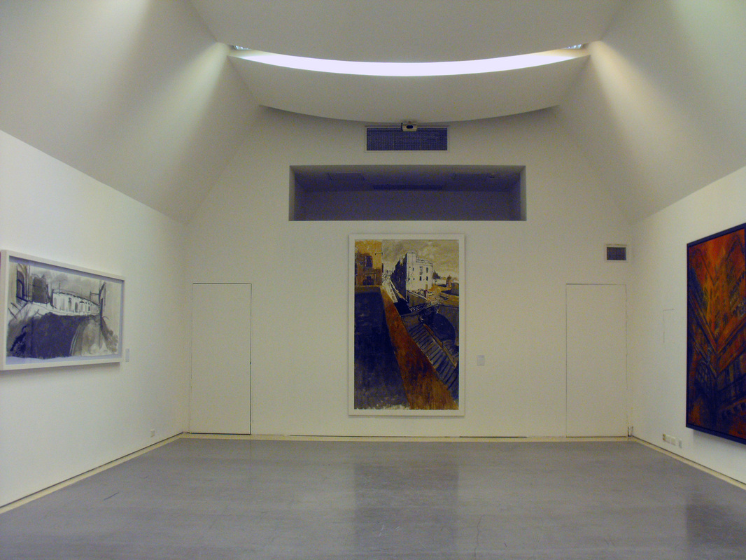
Formal Consideration
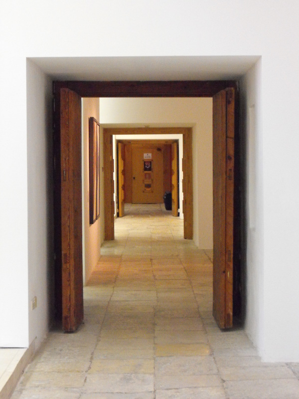
- The room was painted in white paint so that the painting would be the center of attraction.
- The exhibition space was designed very simple.
- Some paintings had white space next to them so that when you look at the painting you will only see that painting.
- Information hierarchy was used in the labels next to the paintings.
- The room had good source of light (yellow and white).
- There was no shadows which is good when seeing paintings.
- Some painting titles where repetitive and not catchy, (example: from the belfry, from here, from off the lift..).
- There was no description / meaning about the painting drawn.
- There wasn't any explanation of why she chose the colours.
Conceptual Considerations
- The message for this exhibition is a solo exhibition of large format streetscapes.
- This exhibition is open for everyone, but it is mostly for those that are interested in Arts.
Visitor Observations
- This exhibition is a shared experience as you ask others what they understand about the paintings.
- I would change the way they were labeled, I would say what the painter was feeling when she drew them.
- Target audience I would say that it is for people that have interest in paintings.
just any space
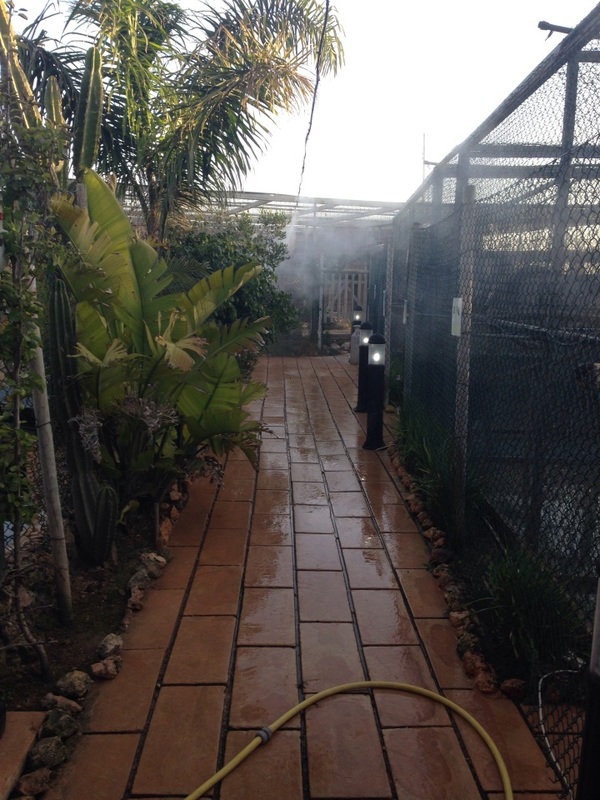
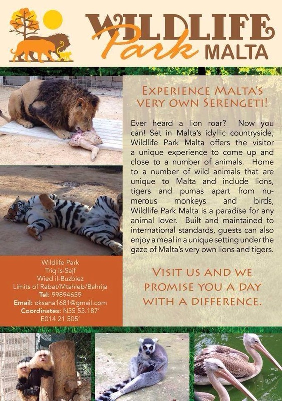
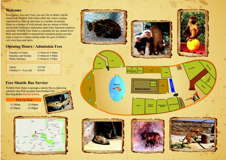
Wildlife Park Malta
Dimensions of space: 2000 square meters.
Height of the ceiling: mainly open air but there's a small restaurant and the entrance.
Lighting: natural light.
Floor surface: mainly cobbled stone but in some parts there was raised flooring with wood.
Sound: animal sounds, people talking, children shouting.
Smell: animal.
Function of space: zoo with different type of exotic animals.
Is space designed for activity level it receives: yes but not if to many people go at once because there isn't enough space to move around.
Accessibility ease: not for people with wheel chair.
Navigation of space (ease): it's quite flowing.
Is lighting adequate: yes it is an open air space.
What makes space unique: the way the place is deigned.
Adjectives to describe space: attractive, expensive, different, secure.
Write out a brief sentence to describe this space: nice place for those that are interested in exotic animals.
sCHOOL EXERCISE - tHE MAKING OF EXHIBITIONS
Group: Myself and Debby Frendo
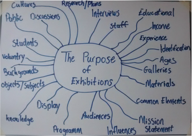
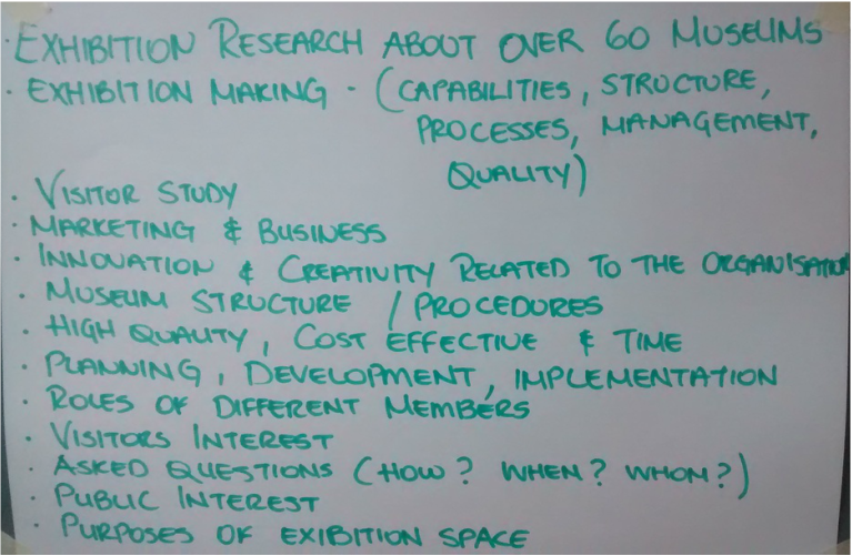
2 - Research
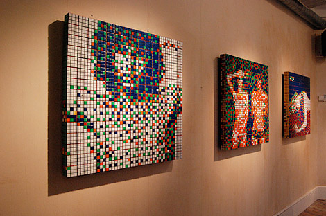
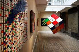
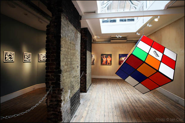
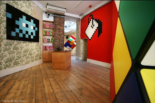
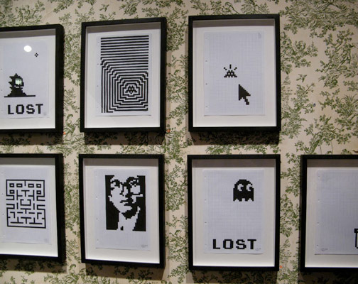
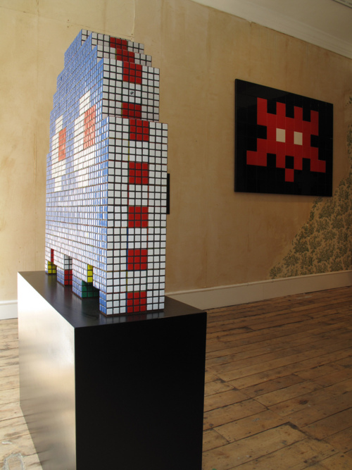
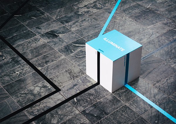
'Low Fidelity' Exhibition - Lazarides Rathbone in London
The French artist internationally recognised for the ubiquitous placement of his logo inspired by the 1970s computer game figure ‘Space Invader’. Showcased within the Rathbone gallery, 'Low Fidelity' features all works from the series ‘Rubikcubism’. Using the famous 80’s puzzle game’s cubes as pixels. Employing modern technology as well as iconic imagery from the dawn of the digital age, the significance of this now global and literal invasion of public space, both inside the gallery and outside, becomes evident as a commentary of this day and age. The gallery has a good source of light, during the day nature light comes in from the top as the top is covered in glass, there are spot lights around the gallery which are hung from the ceiling to light up the room during the night. The gallery has big rooms where people can walk through. The idea used by this French artist looked very retro and classic, the idea was to form album covers with the puzzle game cubes which really looked cool. The images looked like a piece of mosaics, this effect looked very nice.
The French artist internationally recognised for the ubiquitous placement of his logo inspired by the 1970s computer game figure ‘Space Invader’. Showcased within the Rathbone gallery, 'Low Fidelity' features all works from the series ‘Rubikcubism’. Using the famous 80’s puzzle game’s cubes as pixels. Employing modern technology as well as iconic imagery from the dawn of the digital age, the significance of this now global and literal invasion of public space, both inside the gallery and outside, becomes evident as a commentary of this day and age. The gallery has a good source of light, during the day nature light comes in from the top as the top is covered in glass, there are spot lights around the gallery which are hung from the ceiling to light up the room during the night. The gallery has big rooms where people can walk through. The idea used by this French artist looked very retro and classic, the idea was to form album covers with the puzzle game cubes which really looked cool. The images looked like a piece of mosaics, this effect looked very nice.
Navigation
This navigation can be an idea that we can use in the end of year exhibition. This can be placed in the entrance of the school, each class (course) would be presented in different colour with guide lines that will be on the floor and people just have to follow the line to get to the class. I think that is it very important to have something like this to help people that don't know the school, it's also a good benefit for the students so that people attending will visit there exhibition class.
https://www.behance.net/gallery/20617953/AD13-Navigate-Best-Award-Nominee
The Brick Lane Zoo at The Brick Lane Gallery London
“The Brick Lane Zoo” where exotic and wild animals fresh from the city streets cross the globe to showcase at The Brick Lane Zoo. 15 international Street and Urban Artists from the UK, France, Spain, USA, Argentina, Belgium and Germany come together under one roof armed with spraycans, paste ups and stencils to unleash their wild beasts into our urban jungle. Feral animals will roam the gallery walls and stray between the visitors. The upper canopy will be adorned with a striking array of animals ranging from skeletal rhinos and grizzly bears to happy fish. Combining the exceptional talents of our street artists the walls of the gallery will come to life.
The place is not big enough so when there is too many people like the one in the picture bellow the place will be crowed. The artists draw everything on the walls so that the space would be clear. One will surely notice the exhibition when passing by the gallery because of it's large window that can see the inside and also because the front is decorated with flowers and animals to indicate the meaning of this exhibition. Some of the animals where sprayed in black and white, this looks the same way as if he sketched on the wall. I noticed that mainly the animals where over scaled, I think this was done in order for people to notice them and give them attention. The lights were placed on top of the ceiling using spotlights, there was also light tubes under the glass to add more light to the whole room.
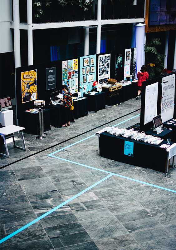
3.a - end of year exhibitions
Group: Stef, Lexy, Naomi, Daphne, Elaine. Martina, Krysta
Projection - Positives
Projection - Negatives
Way-finding - Negatives
Promotion - Positives
Projection - Positives
- New elements
- Interactive
- Lights out effective
Projection - Negatives
- Copied / unoriginal
- Too random
- Slow / lacking excitement for a lot of parts
- Scattered ideas
- Lack of consistency
Way-finding - Negatives
- Non consistent
- Taken for granted
Promotion - Positives
- Interactive
- Consistent
- Inclusive
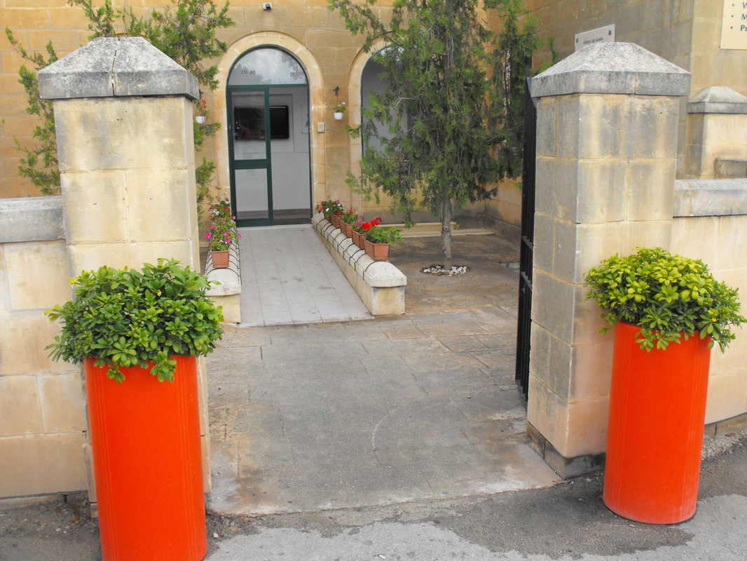
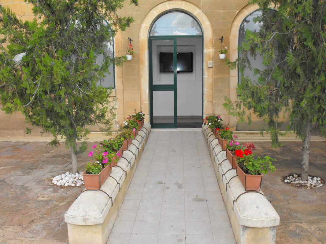
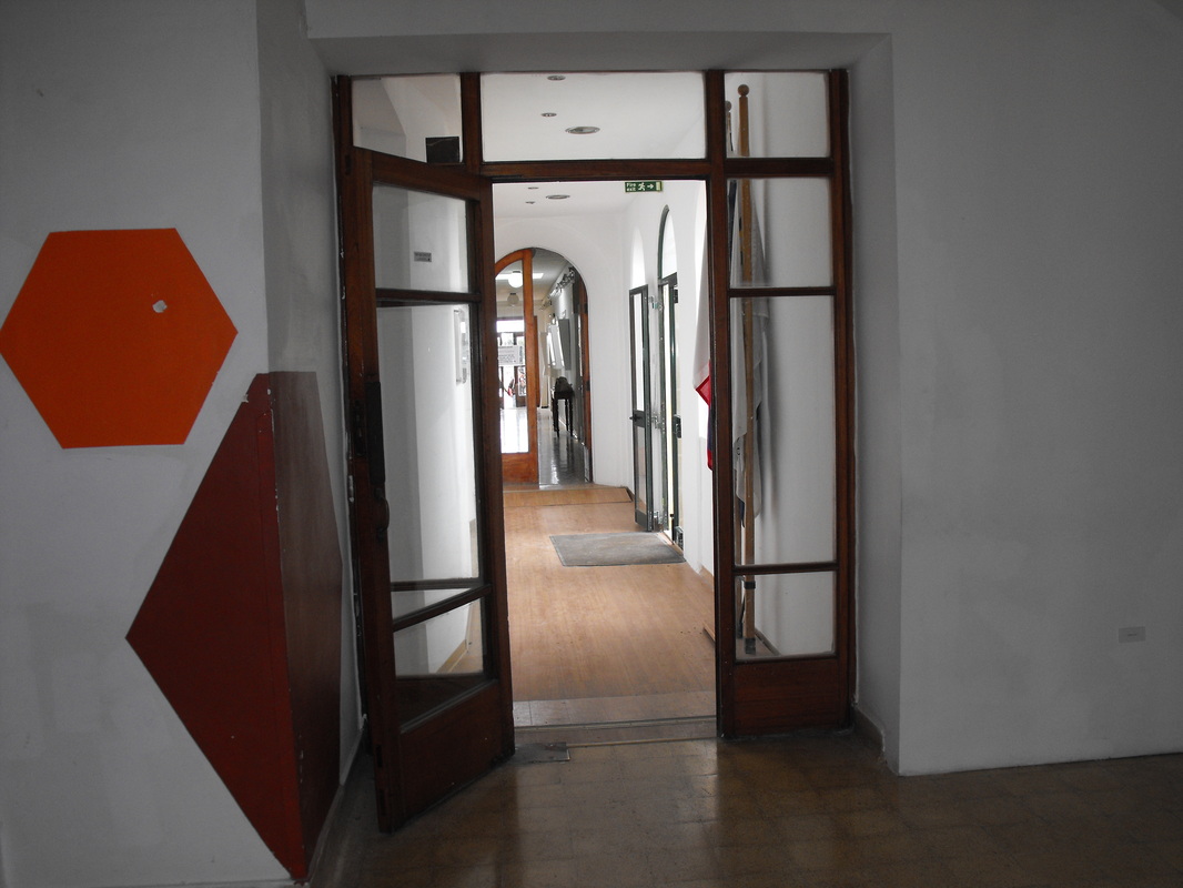
3.b - institute site visit
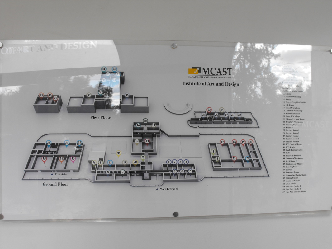
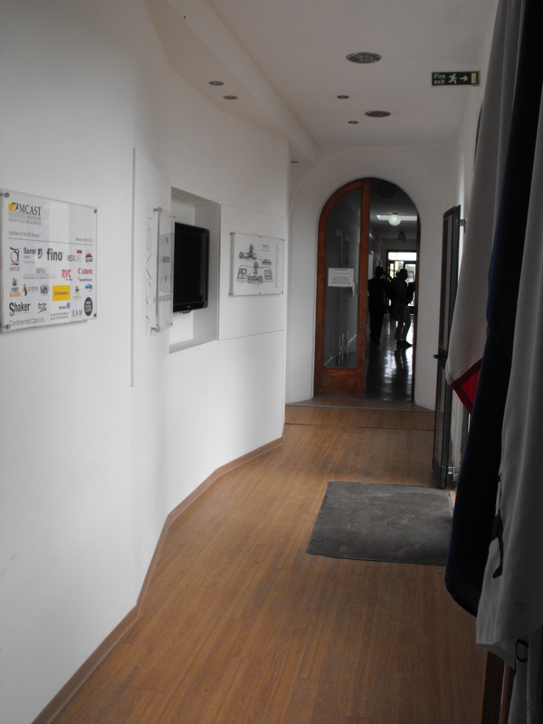
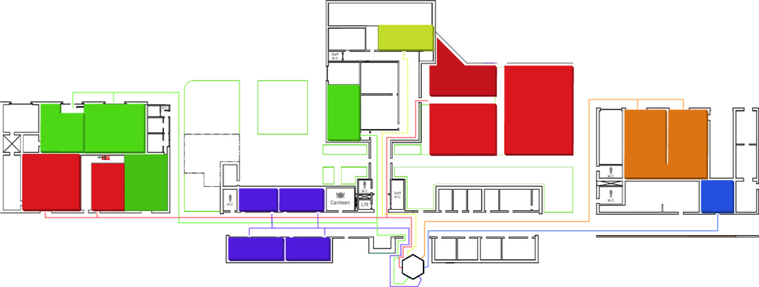
The space I have chosen with our institute is the main entrance to the school. I think that the entrance is to small for activities like the school exhibition as there will be many people. The corridor of the entrance is quite narrow. As you walk in on your right you will see a school map indicating the location for all the rooms. There is a good source of light during the day from natural light that comes in. When going in on the right you will find the administrative section and on the left you can go to the lecture rooms and upstairs.

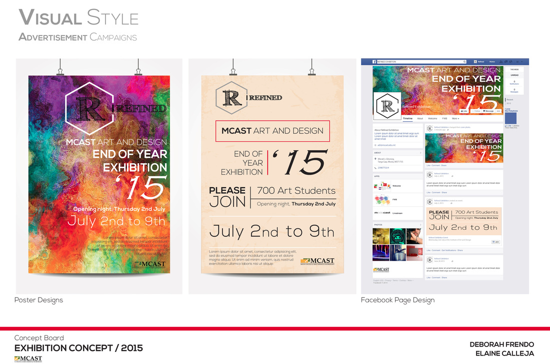
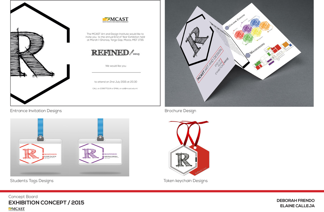
Task 2 - branding an exhibition space
4.a - Concepts for end of year exhibition
Group Members:
Elaine Calleja & Deborah Frendo
Elaine Calleja & Deborah Frendo
Identify the Problem
Proposal Selling Point
Solution for The Problem
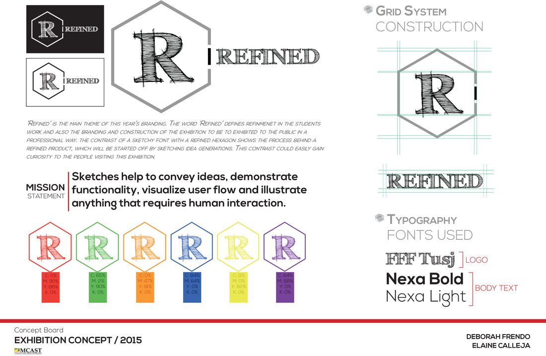
Mission Statement
Sketches help you convey ideas, demonstrate functionality, visualize user flow and illustrate anything that requires human interaction.
- From last years exhibition I have noticed and heard that people that don't know the school don't know where they have to go to see the classes. Way-finding problem.
- Lacks advertisement.
Proposal Selling Point
- A good way-finding and signage for people to know where they have to go.
Solution for The Problem
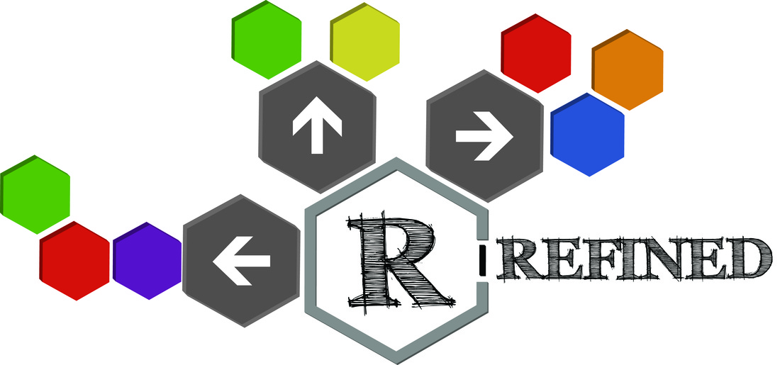
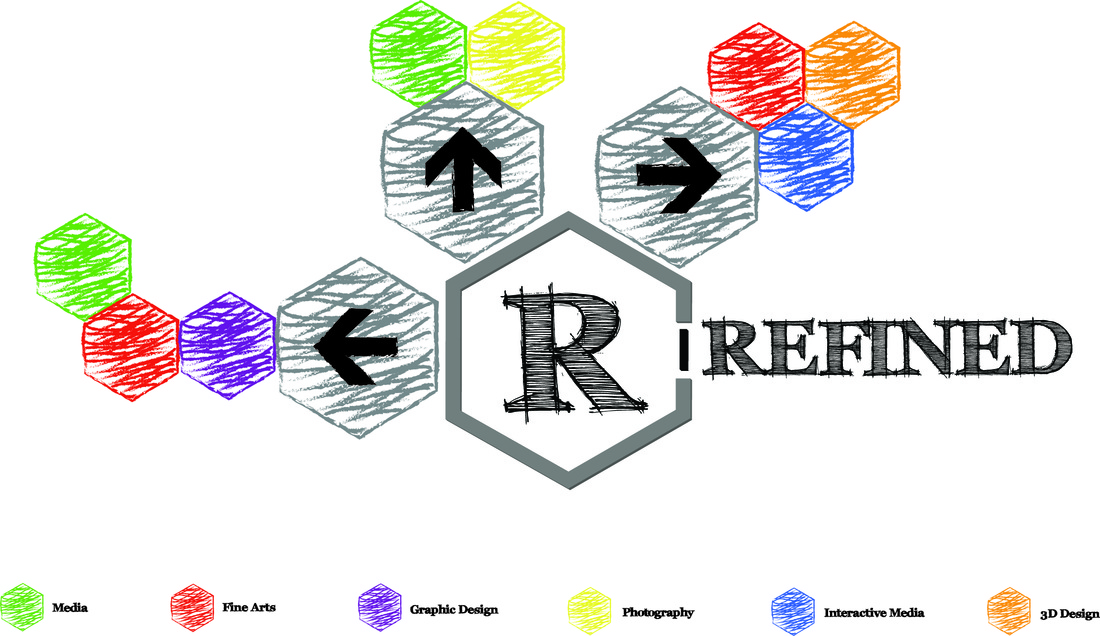
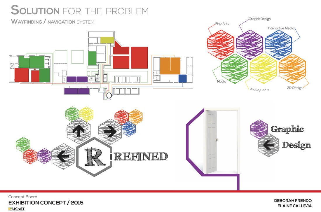
- Better way-finding. We are going to place a box in a shape of a hexagon out side the school main entrance. Each face would represent the course color, then on the floor there would be lines in color that would guide you to the class. Each course name can be die-cut on the face of the hexagon shape. This box can be made from wood or acrylic plastic. In-side the box there would be light changing in different colors according to the course colors.
- Making adverts on bus shelters or billboards.
Mission Statement
Sketches help you convey ideas, demonstrate functionality, visualize user flow and illustrate anything that requires human interaction.
Logo inspiration
|

|
|
|
|
|
|
|
signage, way-finding, navigation $ map inspirations
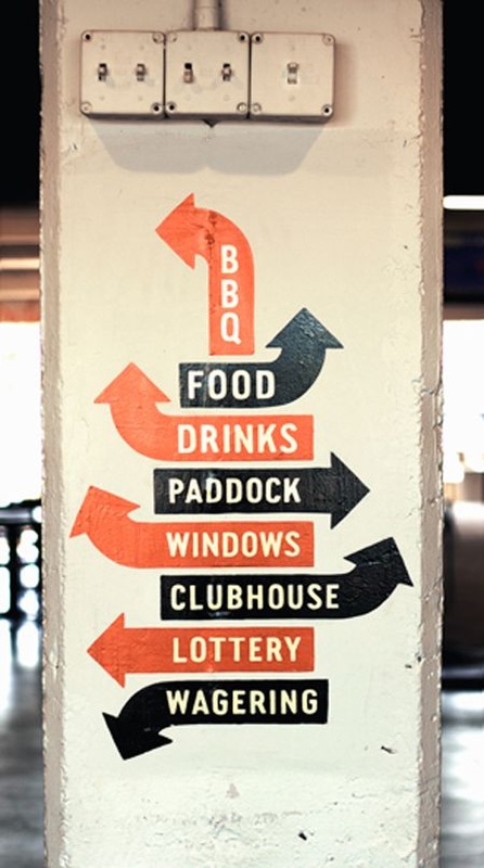
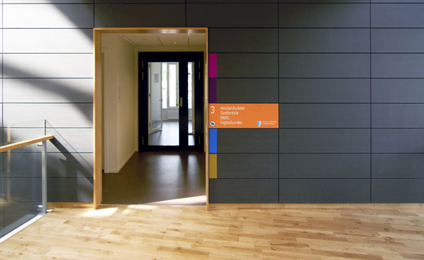
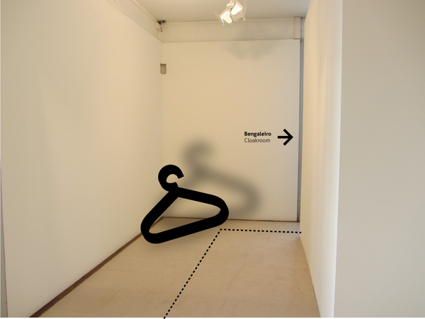
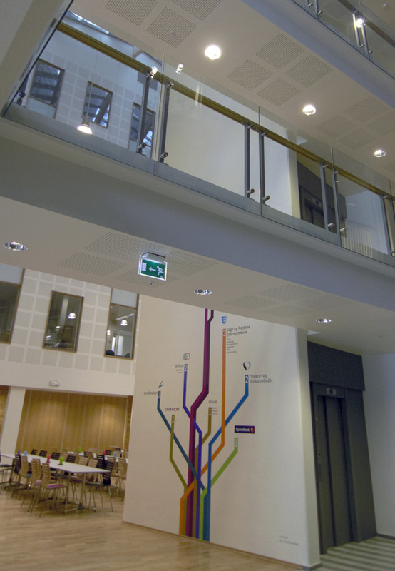
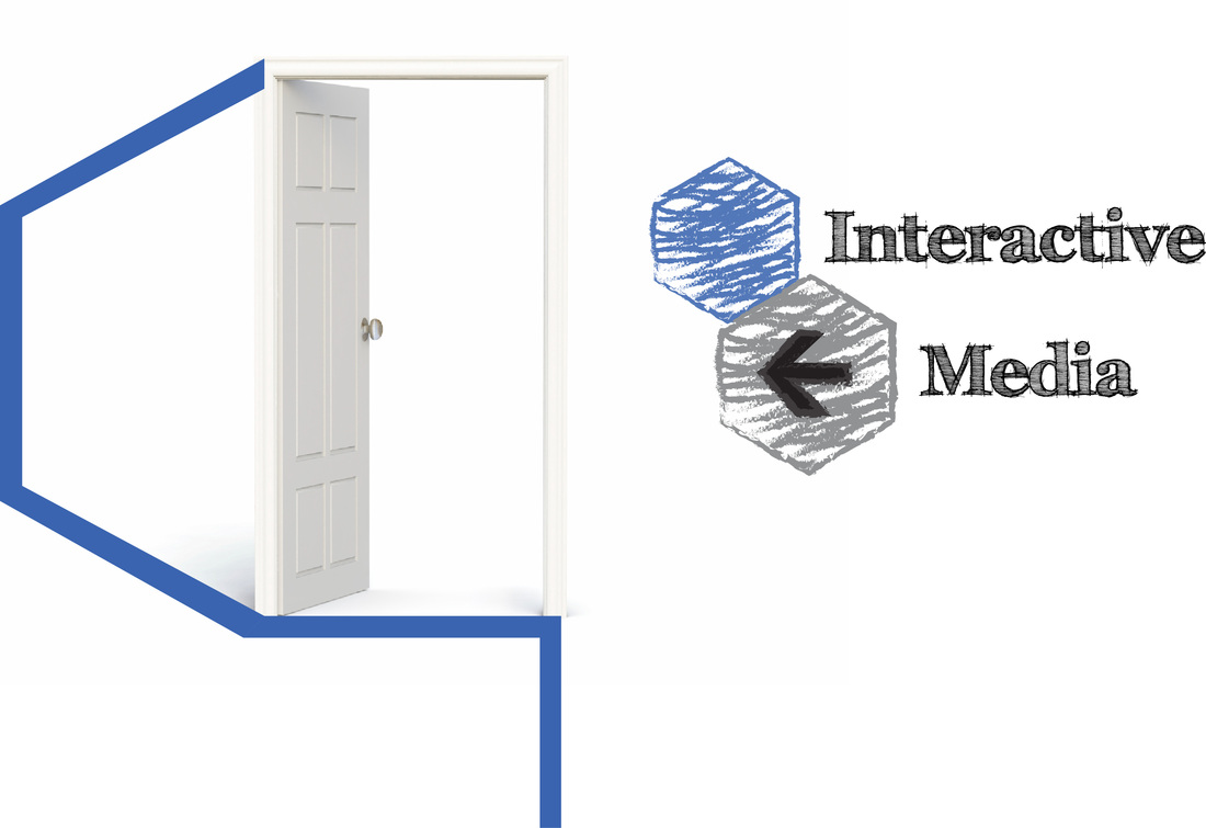
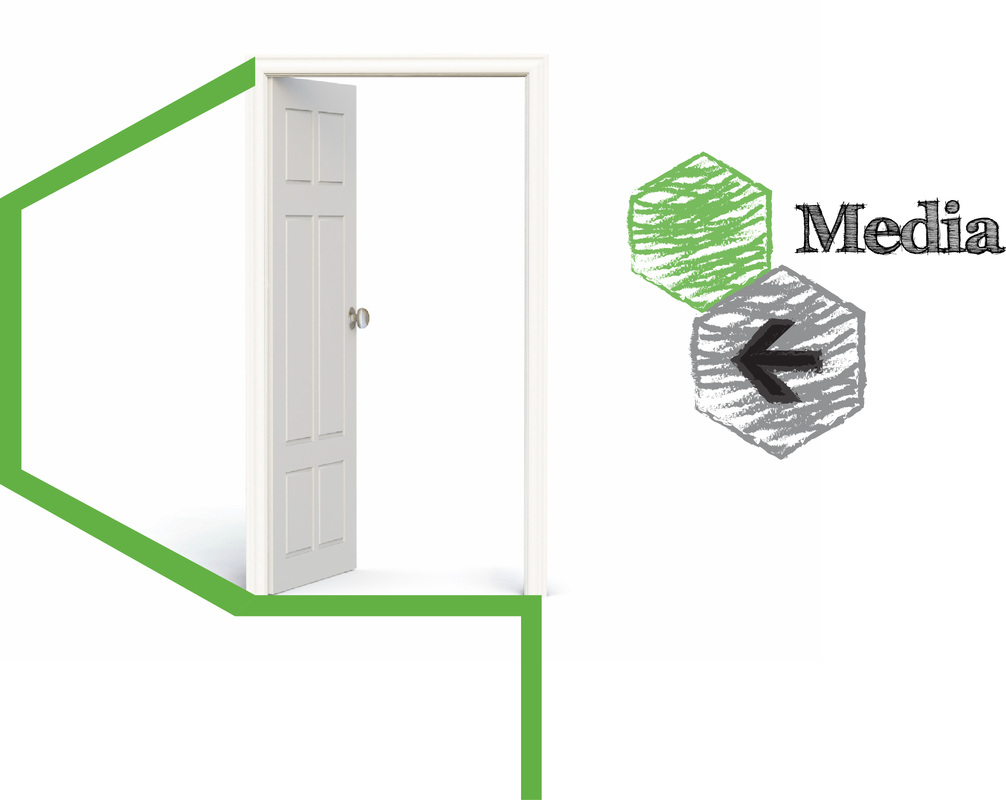
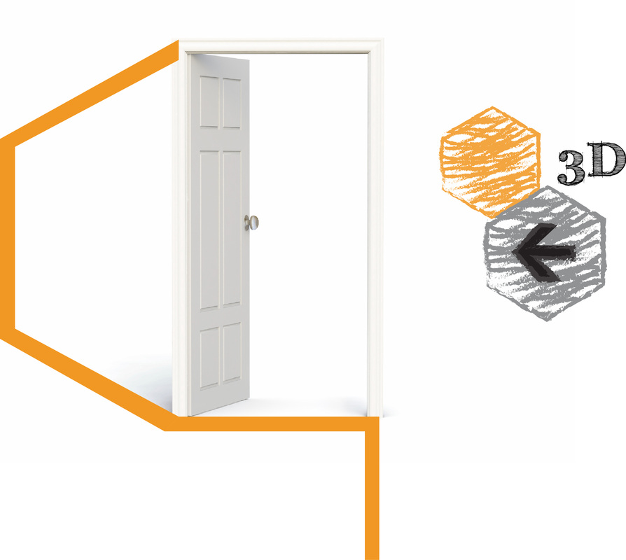
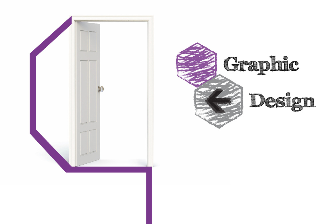
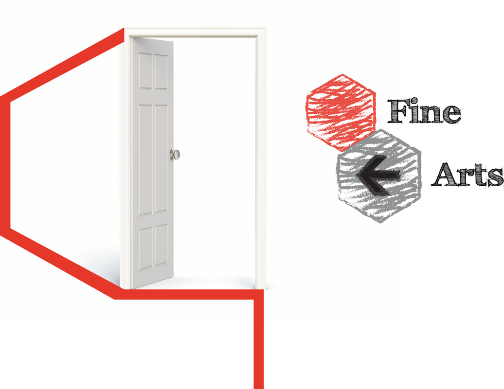
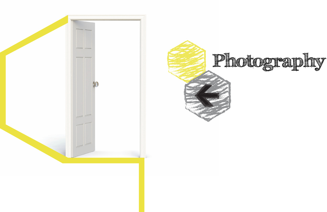
I have designed the bellow icons idea for every course. First I have made them in circles but then as the hexagon shape idea came to mind I did one in a hexagon shape to see how it will look like.
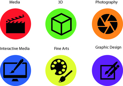
|
|
The bellow are sketches that can be used for our icon designs instead of the previous icon designs. The bellow images will match more with our branding design. The sketches can also be made by any student according to the course.
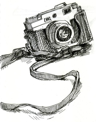
Photography Sketch Icon
Graphic Design Sketch Icon
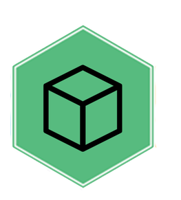
3D Design Sketch Icon
Interactive Media Sketch Icon
Moving Image Sketch Icon
Fine Arts Sketch Icon
The bellow image is a mockup design of how the hexagon shape will look like.
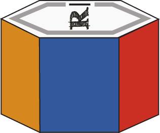
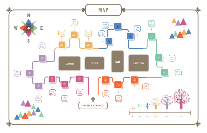
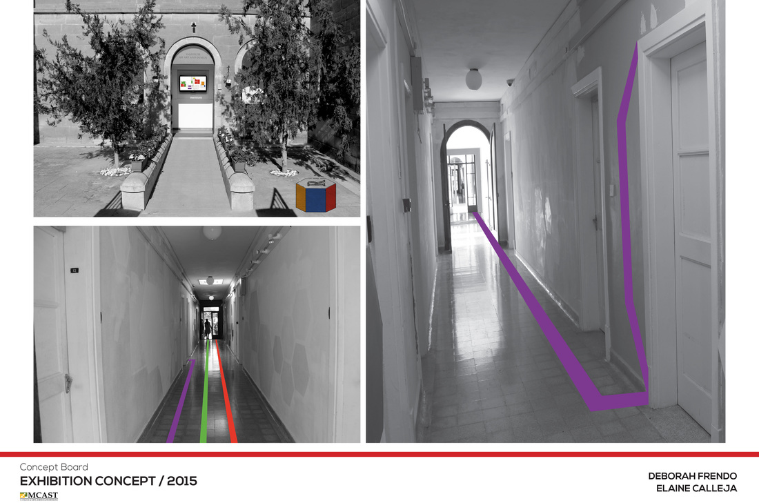
My role was to create a way-finding system, signage and map of the school. I came up with the idea of a hexagon shape because in the exhibition there would be six different courses. A hexagon shape box would be placed out side the entrance of the school. Each face would represent the course color, then on the floor there would be lines in color that would guide people to each course room. Each course name can be die-cut on the hexagon face. This box can be made from wood or acrylic plastic. In-side the box there would be light flashing the courses colors.
Concept Boards
4.b - CONCEPTS FOR END OF YEAR EXHIBITION
Group Members:
Jonathan Bernard Pace
Elaine Calleja
Anton Micallef
Claude Taliana
Christ Scicluna
Jonathan Bernard Pace
Elaine Calleja
Anton Micallef
Claude Taliana
Christ Scicluna
The And - Write Up
This exhibition concept gets its name “THE AND” from the idea of endless curiosity. It represents the satisfaction of that curiosity.
Simply put, instead of focusing on merely displaying artwork, this concept will allow people to learn about what goes into producing an artwork. The brand design itself consists mostly of background images, each image would be specifically tailored towards what the signage is representing whether this could be the course, or even simply toilet sign, the background image will be a representation of the related course’s content. Images will also be edited with a color shift effect. This is done for two reasons; one being that displaying shifted color layers will enhance the idea of curiosity by deliberately making these images slightly harder to analyse, this will allow people to get more involved in trying to understand what the content holds as we would essentially be giving them positive to put together, and the second reason for this edit is to bring a bit of life to the signage, as having bland black-and-white imagery. Otherwise, the edited photographs will become tiring and boring to the audience. While having each image edited with a different color shift effect, it will be able to keep the audience involved and interested with the mystery that the images hold.
The main feature of this branding will be its efficient use of space in the common area. By not allowing any artworks to be displayed within these areas, we not only concern that space but also reduce the risk of the artwork to be stolen or damaged. However, the main purpose for this decision is that nothing will obstruct the wall sayings. On every single wall in the common areas, the visitors will see sayings related to art and design. This may also fill the people with curiosity. Each saying would deliberately be a bit cryptic as to confuse the audience so that they will make themselves work towards understanding the saying. Every saying can be tailored to its specific artwork as well. The whole point of this is to transform the common areas within the school. This is an area which we feel that it has been neglected in terms of its use. Also, by making people more curious we will also be giving them that sense of satisfaction when they reach an understanding of what it takes to produce certain designs and artworks.
The branding and everything that this concept stands for is all designed to make people curious and to make those people want to satisfy that curiosity.
Projection mapping:
One aspect that we wish not to have repeated in this year’s projection mapping is that it would look like showcase of different animations without a definite story, so one feature we would include would be by giving the audience the element of choice, by making the projection interactive. By doing this, we would not only enhance the experience for the audience but also feeding their curiosity and thereby satisfying it. The way this would work would be simple; we would be splitting the projection story up into a minimum of five defined sections which we can easily implement, let's say section 1 is unchanging, however sections two to four have moments where the animation pauses and like in a game, the audience will have to choose between two options that can determine the flow of the story, and therefore it would determine the ending of the story.
The way people would choose would be determined with color maps. Each audience member would be provided with a marker with two sides, one green and one red. These would then be displaying their preferred color. The choice would be voted upon, and the majority determines the direction that the story would take.
One would ask: “What about the sections of the story that will be unseen?” This is easily solved with one of these two options, either the projection is repeated as a later time allowing people to make the choice again or the projection is repeated only on small computer screens spread out across the school again, alone bringing the element of choice.
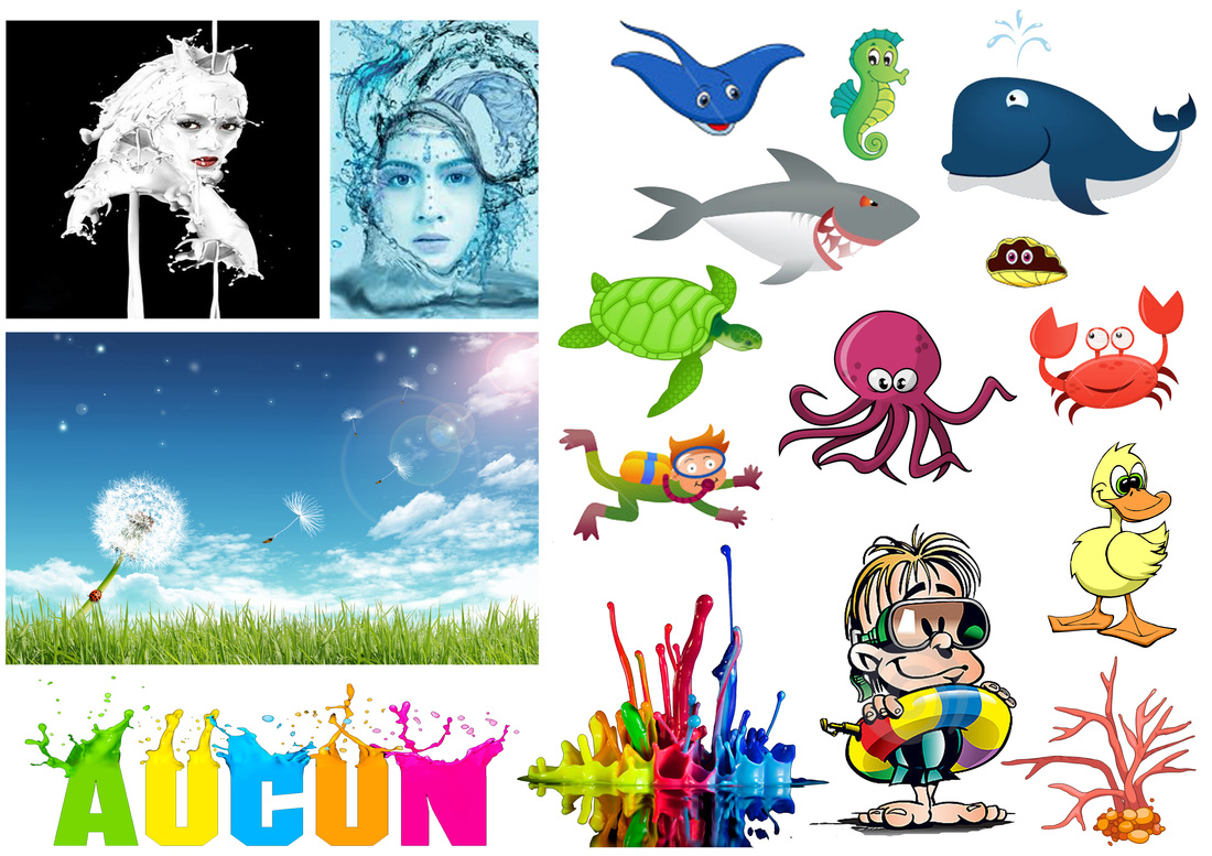
The story itself, although at this point in time not defined, will revolve around the element of water.
Interactivity:
One way to involve people is by producing a set of interactive games. Apart from what has already been mentioned in terms of the projection mapping having the element of choice, people would become more curious due to the wall installation and one way we can also get people involved is by making them find each courses mascot. Each person will be given the chance to take a card from a dispenser and on the card there will be an image of the mascot to be found as well as a description of the character. This in turn can be linked to the wall sayings, where apart from having sayings about art and design, certain parts of these walls will also have hints as to where the character would be hiding.
This can be looked at as a fun game for children and young adults alike. If people manage to find either all of the characters or a set number of them, they would be eligible for a prize. This prize is yet to be determined.
This exhibition concept gets its name “THE AND” from the idea of endless curiosity. It represents the satisfaction of that curiosity.
Simply put, instead of focusing on merely displaying artwork, this concept will allow people to learn about what goes into producing an artwork. The brand design itself consists mostly of background images, each image would be specifically tailored towards what the signage is representing whether this could be the course, or even simply toilet sign, the background image will be a representation of the related course’s content. Images will also be edited with a color shift effect. This is done for two reasons; one being that displaying shifted color layers will enhance the idea of curiosity by deliberately making these images slightly harder to analyse, this will allow people to get more involved in trying to understand what the content holds as we would essentially be giving them positive to put together, and the second reason for this edit is to bring a bit of life to the signage, as having bland black-and-white imagery. Otherwise, the edited photographs will become tiring and boring to the audience. While having each image edited with a different color shift effect, it will be able to keep the audience involved and interested with the mystery that the images hold.
The main feature of this branding will be its efficient use of space in the common area. By not allowing any artworks to be displayed within these areas, we not only concern that space but also reduce the risk of the artwork to be stolen or damaged. However, the main purpose for this decision is that nothing will obstruct the wall sayings. On every single wall in the common areas, the visitors will see sayings related to art and design. This may also fill the people with curiosity. Each saying would deliberately be a bit cryptic as to confuse the audience so that they will make themselves work towards understanding the saying. Every saying can be tailored to its specific artwork as well. The whole point of this is to transform the common areas within the school. This is an area which we feel that it has been neglected in terms of its use. Also, by making people more curious we will also be giving them that sense of satisfaction when they reach an understanding of what it takes to produce certain designs and artworks.
The branding and everything that this concept stands for is all designed to make people curious and to make those people want to satisfy that curiosity.
Projection mapping:
One aspect that we wish not to have repeated in this year’s projection mapping is that it would look like showcase of different animations without a definite story, so one feature we would include would be by giving the audience the element of choice, by making the projection interactive. By doing this, we would not only enhance the experience for the audience but also feeding their curiosity and thereby satisfying it. The way this would work would be simple; we would be splitting the projection story up into a minimum of five defined sections which we can easily implement, let's say section 1 is unchanging, however sections two to four have moments where the animation pauses and like in a game, the audience will have to choose between two options that can determine the flow of the story, and therefore it would determine the ending of the story.
The way people would choose would be determined with color maps. Each audience member would be provided with a marker with two sides, one green and one red. These would then be displaying their preferred color. The choice would be voted upon, and the majority determines the direction that the story would take.
One would ask: “What about the sections of the story that will be unseen?” This is easily solved with one of these two options, either the projection is repeated as a later time allowing people to make the choice again or the projection is repeated only on small computer screens spread out across the school again, alone bringing the element of choice.
The story itself, although at this point in time not defined, will revolve around the element of water.
Interactivity:
One way to involve people is by producing a set of interactive games. Apart from what has already been mentioned in terms of the projection mapping having the element of choice, people would become more curious due to the wall installation and one way we can also get people involved is by making them find each courses mascot. Each person will be given the chance to take a card from a dispenser and on the card there will be an image of the mascot to be found as well as a description of the character. This in turn can be linked to the wall sayings, where apart from having sayings about art and design, certain parts of these walls will also have hints as to where the character would be hiding.
This can be looked at as a fun game for children and young adults alike. If people manage to find either all of the characters or a set number of them, they would be eligible for a prize. This prize is yet to be determined.
Water Research
Water Meaning
A colorless, odourless compound of hydrogen and oxygen. Water covers about three-quarters of the Earth’s surface in solid form and liquid form, and is prevalent in the lower atmosphere in its gaseous form, water vapour. Water is an unusually good solvent for a large variety of substances, and is an essential component of all organisms, being necessary for most biological processes. Unlike most substances, water is less dense as ice then in liquid form, thus ice floats on liquid water. Water freezes at 0˚C (32˚F) and boils at 100˚C (212˚F)
Water is often used to symbolize things in literature. Water is a universal symbol of change and is often present at turning points in a story. Since water is often a sign of life, many times water represents life. Likewise, water can also represent death. Water can also be up into two categories: fresh water and bad/polluted water. Fresh water can represent good health, and bad water symbolizes bad health. It also represents thirst, since people drink water when they are thirsty.
Quotes
“Anger is like flowing water; there's nothing wrong with it as long as you let it flow. Hate is like stagnant water; anger that you denied yourself the freedom to feel, the freedom to flow; water that you gathered in one place and left to forget. Stagnant water becomes dirty, stinky, disease-ridden, poisonous, deadly; that is your hate. On flowing water travels little paper boats; paper boats of forgiveness. Allow yourself to feel anger, allow your waters to flow, along with all the paper boats of forgiveness. Be human.”
― C. JoyBell C.
“Water does not resist. Water flows. When you plunge your hand into it, all you feel is a caress. Water is not a solid wall, it will not stop you. But water always goes where it wants to go, and nothing in the end can stand against it. Water is patient. Dripping water wears away a stone. Remember that, my child. Remember you are half water. If you can't go through an obstacle, go around it. Water does.”
― Margaret Atwood, The Penelopiad
- Life
- Motion
- Renewal
- Blessing
- Intuition
- Reflection
- Subconscious
- Fertilization
- Purification
- Transformation
A colorless, odourless compound of hydrogen and oxygen. Water covers about three-quarters of the Earth’s surface in solid form and liquid form, and is prevalent in the lower atmosphere in its gaseous form, water vapour. Water is an unusually good solvent for a large variety of substances, and is an essential component of all organisms, being necessary for most biological processes. Unlike most substances, water is less dense as ice then in liquid form, thus ice floats on liquid water. Water freezes at 0˚C (32˚F) and boils at 100˚C (212˚F)
Water is often used to symbolize things in literature. Water is a universal symbol of change and is often present at turning points in a story. Since water is often a sign of life, many times water represents life. Likewise, water can also represent death. Water can also be up into two categories: fresh water and bad/polluted water. Fresh water can represent good health, and bad water symbolizes bad health. It also represents thirst, since people drink water when they are thirsty.
Quotes
“Anger is like flowing water; there's nothing wrong with it as long as you let it flow. Hate is like stagnant water; anger that you denied yourself the freedom to feel, the freedom to flow; water that you gathered in one place and left to forget. Stagnant water becomes dirty, stinky, disease-ridden, poisonous, deadly; that is your hate. On flowing water travels little paper boats; paper boats of forgiveness. Allow yourself to feel anger, allow your waters to flow, along with all the paper boats of forgiveness. Be human.”
― C. JoyBell C.
“Water does not resist. Water flows. When you plunge your hand into it, all you feel is a caress. Water is not a solid wall, it will not stop you. But water always goes where it wants to go, and nothing in the end can stand against it. Water is patient. Dripping water wears away a stone. Remember that, my child. Remember you are half water. If you can't go through an obstacle, go around it. Water does.”
― Margaret Atwood, The Penelopiad
Interactive Ideas
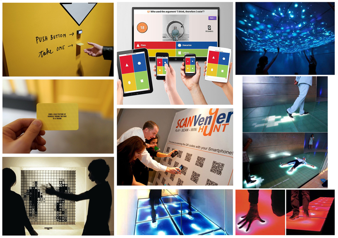
An interactive idea which in our case can be done in our school corridor. When people walk through this interactive floor something will change, like example steps behind them when walking, or stepping on something while walking.
Interactive Floor/Wall
An unusual and exciting product that combines all the fun elements of dancing flames, shimmering water, floating fish, blooming flowers and visual characteristics into one single system. With the element of surprise, users become captivated with the interactive floor. The interactive floor system is unusual, exciting and modern.
Imagine yourself walking in a fish restaurant, over a swimming pool filled with shimmering water, goldfish swimming through water. Then as you walk you see ripples in the water, hear sounds of your footsteps and see the fish darting away from your feet.
System Requirements
The Water Theme can give the sense of being out on a rainy day, splashing in puddles, or throwing stones in a pond, watching the water rippling.
An unusual and exciting product that combines all the fun elements of dancing flames, shimmering water, floating fish, blooming flowers and visual characteristics into one single system. With the element of surprise, users become captivated with the interactive floor. The interactive floor system is unusual, exciting and modern.
Imagine yourself walking in a fish restaurant, over a swimming pool filled with shimmering water, goldfish swimming through water. Then as you walk you see ripples in the water, hear sounds of your footsteps and see the fish darting away from your feet.
System Requirements
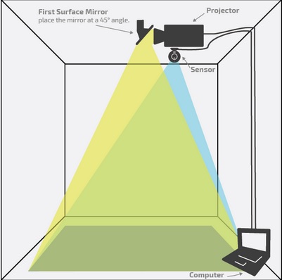
- Projector
- Computer
- IR Camera (Xbox360 Kinect)
- Video capture module
- Sound reproduction
- Cables
The Water Theme can give the sense of being out on a rainy day, splashing in puddles, or throwing stones in a pond, watching the water rippling.
|
|
|
|
|
|
This is how we can setup the projection area:
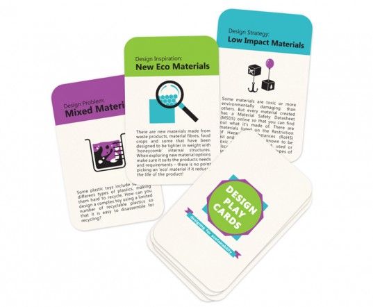
Cards Design Ideas for the ticketing system:
group manifesto
Key points:
1. The And exhibition, is intended to create curiosity in the average person. Curiosity plays a fundamental part in our lives as if we were never curious about what goes on around us. The word progress would technically explain to that without curiosity, people all around world would have never become what they are today.
Why do people become curious? We all wish to satisfy this curiosity just like in the proverb "curiosity killed the cat where it may incidentally get itself injured or killed due to it being so curious". The same goes for humanity as if we were not curious.
While we satisfy our curiosity, we learn and we also become enlightened and stronger.
2. In terms of design, we are constantly curious about what are we going to create to keep all the visitors curious. At the best of times, unknowingly, satisfy ourselves with what we create. Good design should always save a sense of pleasure not just to the client and the users, but also to the creators.
When taking into consideration elements of design such as functionality, depending on the context of this word functionality, always speaks towards the user whether it's a designed chair or a piece of typography both have their uses, whether one provides comfort in a physical form and others can provide comfort in their thoughts. Either way, good design should always leave you thinking about what's going through the mind of the person who created this work and that is where this point 'Curiosity' takes control.
As designers we say to ourselves that we require many elements to produce any kind of work, whether it is graphic design, 3D design or just fashion. We say to ourselves that we require a theme, we require inspiration, we need visual aids and all this can be true. The intention of the work is the most important piece of information that we all require but it is by far one key point that many of us neglect to mention. Without an intention, what ever is designed will technically have no purpose.
3. In the case of keeping things interesting and entertaining, one of the key aspects that should always be present is the meaning and intention of the work. i.e. something that attracts curiosity, this can be done with elements based on the five senses but this is dependent completely on the work in question.
Manifesto
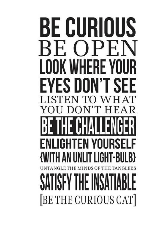
- Be Curious
- Be Open
- Look where your eyes don’t see
- Listen to what you don’t hear
- Enlighten yourself with an unlit lightbulb.
- Be the challenger
- be the curious cat
- untangle the minds of the tanglers
- Satisfy the insatiable.
- In a moment, one can leap into the unknown with the full satisfaction of not knowing.
This video shows basically how our installation is to be created.For this installation we need: a wooden frame, mirror, glass, silver tint and LED light.
For the manifesto installation we need to buy silver tinted, Jonathan told me to take care to buy silver tint from somewhere. First I went to check the price from Falcar in Mosta, then I went to two more shop to try and find cheaper and maybe someone will have about 1meter instead of a roll cause we needed about 70cm but they told me that silver tint is not being used any more. I also have sent a message on Facebook to two more shops but got no answer from them. Then I had to go and buy it from Falcar cause there I found available.
Manifesto Feedback
Today the 27th of January together with Johnathan and Claude we went to get some feedback about our manifesto from students at school. About 21 students gave as there feedback. Although I was very shy to ask people to come and tell us what they think about our installation I have still managed to ask some people to tells us there feedback. We have asked to them, what they do think about it? On whole we have got more positive feedback about the installation. The effect of this installation brought them more curiosity the way how it was designed and the tunnel effect. Some of the negative feedback's where that the reflection of themselves in-front of this mirror was distracting them, the notice board at the back also was distracting them as this was being shown from the mirror, and one person told us that the light should have been yellow instead of bright white.
Today the 27th of January together with Johnathan and Claude we went to get some feedback about our manifesto from students at school. About 21 students gave as there feedback. Although I was very shy to ask people to come and tell us what they think about our installation I have still managed to ask some people to tells us there feedback. We have asked to them, what they do think about it? On whole we have got more positive feedback about the installation. The effect of this installation brought them more curiosity the way how it was designed and the tunnel effect. Some of the negative feedback's where that the reflection of themselves in-front of this mirror was distracting them, the notice board at the back also was distracting them as this was being shown from the mirror, and one person told us that the light should have been yellow instead of bright white.
DESIGNING FOR THE 5 SENSES
HEXENSE is a multi-sensory experience kiosk using holographic and haptic technology. The six screens represent each of the six senses. Although there are many more senses, the six senses most noteworthy are:
The six senses addressed by Hexense kiosk are:
Visual (sight)
Auditory (sound)
Olfactory (smell)
Tactile (touch)
Gustatory (taste_
Kinesthetic (position / movement)
The user is able to experience a high level of engagement, with the immersive holographic kiosk and the haptic Feelscreen technology by Senseg.
http://www.prattdigital.org/future-interfaces-nyc-media-lab-presentation/
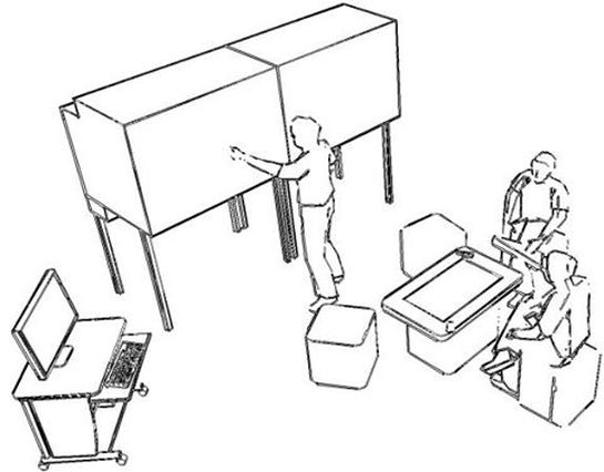
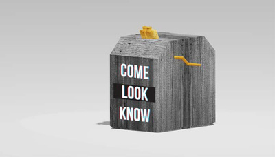
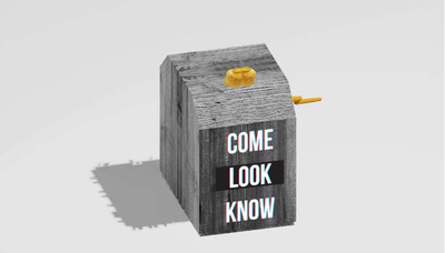
OUR KINETOSCOPE MODEL USING 3 SENSES
|
|
The above images show a kinetoscope model which we can build to advertise the school end of year exhibition. this can be placed in public places outside the school for people to see and visit our exhibition.
The words written on the kinetoscope 'Come Look Know' will make people curious and they will look through to lens to see whats inside this box. We can show behind the scenes of the exhibition preparations, how the exhibition is being prepared and also group course trailers. Sound can be played in the background to make people more curious. This works when a person rolls the handle, then the person sees the video from the scope. When the person stops rolling the handle the video will stop as-well.
The words written on the kinetoscope 'Come Look Know' will make people curious and they will look through to lens to see whats inside this box. We can show behind the scenes of the exhibition preparations, how the exhibition is being prepared and also group course trailers. Sound can be played in the background to make people more curious. This works when a person rolls the handle, then the person sees the video from the scope. When the person stops rolling the handle the video will stop as-well.
Presentation Day
As a group we have discussed which slides each one of us has to talk about for the presentation day from about a week before. Then each of us had planned what to say during the presentation and discussed them with Jonathan to see if we where saying everything. In the morning the day of the presentation we have made one last practice before the presentation in the hall. I did really good because I know what I had to say and I was prepared even Jonathan said that I did well. Unfortunately I felt that I did not go well in the hall presentation because I was prepared to speak in Maltese then they told us to speak in English. I am not an English speaking person and I also have stage fright when presenting something in front of others.
As a group we have discussed which slides each one of us has to talk about for the presentation day from about a week before. Then each of us had planned what to say during the presentation and discussed them with Jonathan to see if we where saying everything. In the morning the day of the presentation we have made one last practice before the presentation in the hall. I did really good because I know what I had to say and I was prepared even Jonathan said that I did well. Unfortunately I felt that I did not go well in the hall presentation because I was prepared to speak in Maltese then they told us to speak in English. I am not an English speaking person and I also have stage fright when presenting something in front of others.
