Art and Design Methods & Art and Design Principles
Task 1.1 - Research
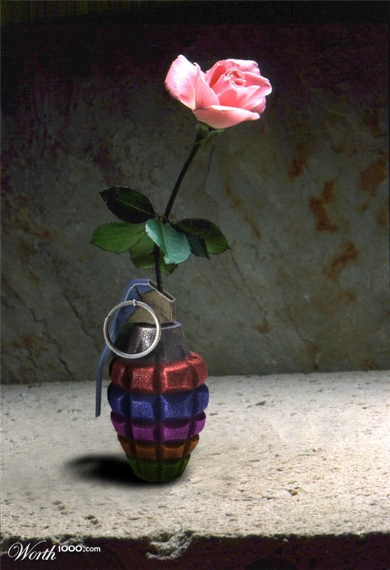
Battersea Power Station Annual Party
Art and design principles
This projection mapping is very well designed. I enjoyed many parts in this projection mapping the way it was designed. The first part was really nice when showing the inside of the building and the mechanism. Lights and sounds where also good with the projection mapping. In my opinion the sound chosen made me dance and want to watch whats going to happen next. the way it ends with the heart beat sound shows that the power station is back on.
Elements of design
In this projection mapping we can see different elements used like: lines, colours, photos, silhouettes (batman and the lady modeling), 3D and 2D shapes. The building is precisely drawn and projected. All together these formed a very interested projection which was certainly attractive for the people watching it live.
Formal qualities
The projection starts with a classic Art Deco look, showcasing the chimneys and original design features. The sound was very well synchronized and very well chosen for each particular scene, example when the cube moves through the pipe the volume of the sound is lowered and when the cube goes out the volume goes up again.
Function
Drive production created a motivating visual experience to promotion awareness for the iconic building spectacular redevelopment in front of thousands people. They worked to tell the story of the power station showcasting its past, present and future.
Ralph Lauren 4D
Art and design principles
Ralph Lauren stores were brought to life as they were transformed into a cat walk stage with male and female models. This projection mapping also had an interactivity with people that where watching it live in front of the building when the air was sprayed with Ralph Lauren's fragrance when a bottle of perfumed appeared.
Elements of design
This projection was a 4D experience were the audience was also involved. There is a mixture of 2D, 3D and 4D elements in this projection mapping. Video footage was used as part of the projection mapping. Depth and light were used to create the 3D of the facade.
Formal qualities
I have noticed and liked the effect of ray light going in and out of the windows. also to make it look more realistic they have shot the models on a green screen for the cat walk part. the best think from this projection was when the building transformed in a stage.
Function
From the start one could notice that it was an advert for Ralph Lauren so it was also a way of communication with the audience watching it. I found this projection very entertaining the way it was designed. I liked the part where one of the man on the horses froze and became the logo on one of the perfumes. In my opinion I think that the whole projection mapping was interested the way it was.
Form
The flagship disappeared is then transformed into a series of objects and images rendered in three-dimensional space.
The 600 Years
Art and design principles
When Prague's famous astronomical clock turned 600, the Macula and Tomato productions created a projection mapping for the tower celebrating its history. This projection is very well designed and has a synchronized sound. I enjoyed everything about this projection mapping the way it was designed.
Elements of design
In this we see that many elements where used like: 2D, 3D, lines, colours and different textures.
Formal qualities
Each part of the screening described the most important chapters from the clock history. The way this projection started in drawing the clock with white lines and then building the clock with bricks was very interested. The part when it's starts to rain was really realistic.
Function
It's function was to celebrate the clock's tower 600th anniversary. The communication was to show the dramatic history that this clock tower went through. The audience also got a unique occasion to gaze inside the clock itself. The closing effect is part spectacle, part documentary and a wonderful implemented combination of medieval architecture and modern technology.
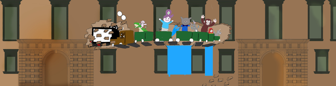
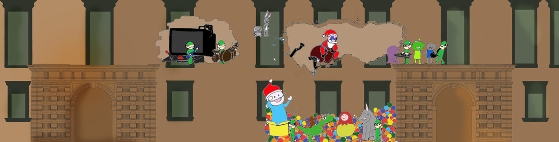
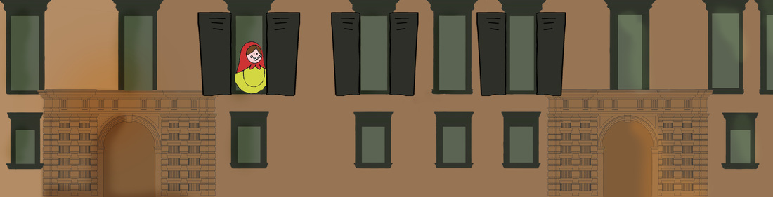
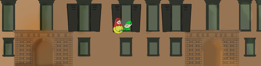
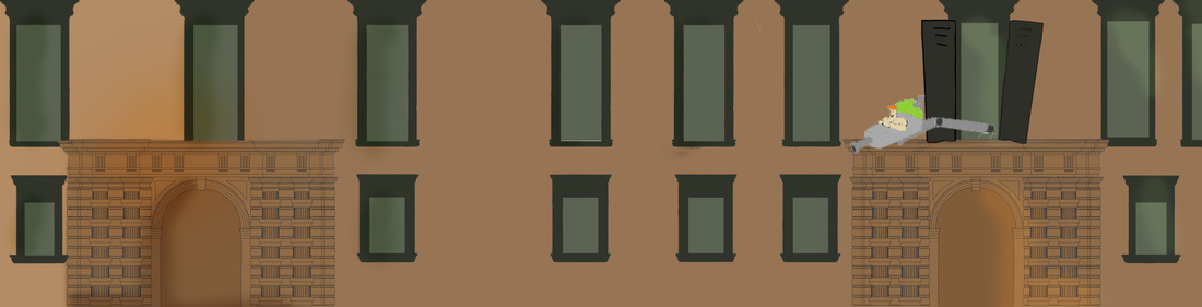
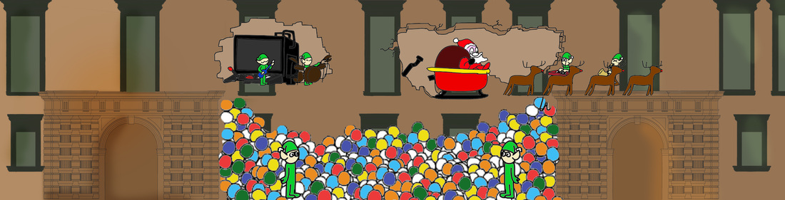
MCAST & V18 Architectural Projection Mapping Animation 2013
Likes
Likes
- The way it started was very peaceful
- The snow flakes
- The toy maker machine
- Lights and shadows
- The way the Christmas tree was formed
- The crib in stained glass
- The wrapper designs
- The animation for V.18
- Animated sketches
Dislikes
- When one of the snowflakes came to a door knob
- The doors opening
- The transitions of some parts
- The blackout
Design Methodologies
Divergence
Divergence is exploring potential situations by using critical thinking through research methods to create new understanding problem space towards a better design. This is a stage where research has to be done. Brainstorming ideas is important, members spontaneously generate ideas in response to a problem statement, generating many ideas as possible, consider the creative combination of ideas. Participants need to ask themselves, what is dangerous? What is valuable? What is feasible?
Transformation
This is the phase when goals, brief, problem limitations are fixed, once critical variables are identified, after constraints are recognized, when opportunities are taken and when judgments are made. Pattern making is done in this stage. the object here is to impose upon the results of the divergent search a pattern that is detailed enough to permit convergence to a single design.
Convergence
This is the stage where your thinking comes to a conclusion, an answer and closure to the topic in question. The designer's target is to prototype imaginable scenarios for better design solution that improve the originally inherited situation. The designer must look to reduce the secondary doubts gradually until only one of several possible alternative designs is left.
Sustainability
This stage is handling the process of exploring, redefining and prototyping of design solutions constantly over time.
Articulation
The articulation is the last stage where there is the visual relationship between the parts and the whole.
Task 1.2 - Design Company
Group - Jonathan Bernard Pace
Elaine Calleja
Lexy Sant Manduca
Stef Spiteri
Krysta Maria Micallef
Elaine Calleja
Lexy Sant Manduca
Stef Spiteri
Krysta Maria Micallef
|
Immersive Surfaces
|
|
|
Omicron
|
|
|
Battersea Power Station
|
|
|
Hyundai Accent (Verna)
|
|
|
Making off - Mapping Sant Climent de Taull
|
|
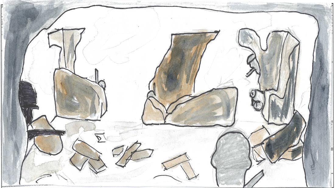
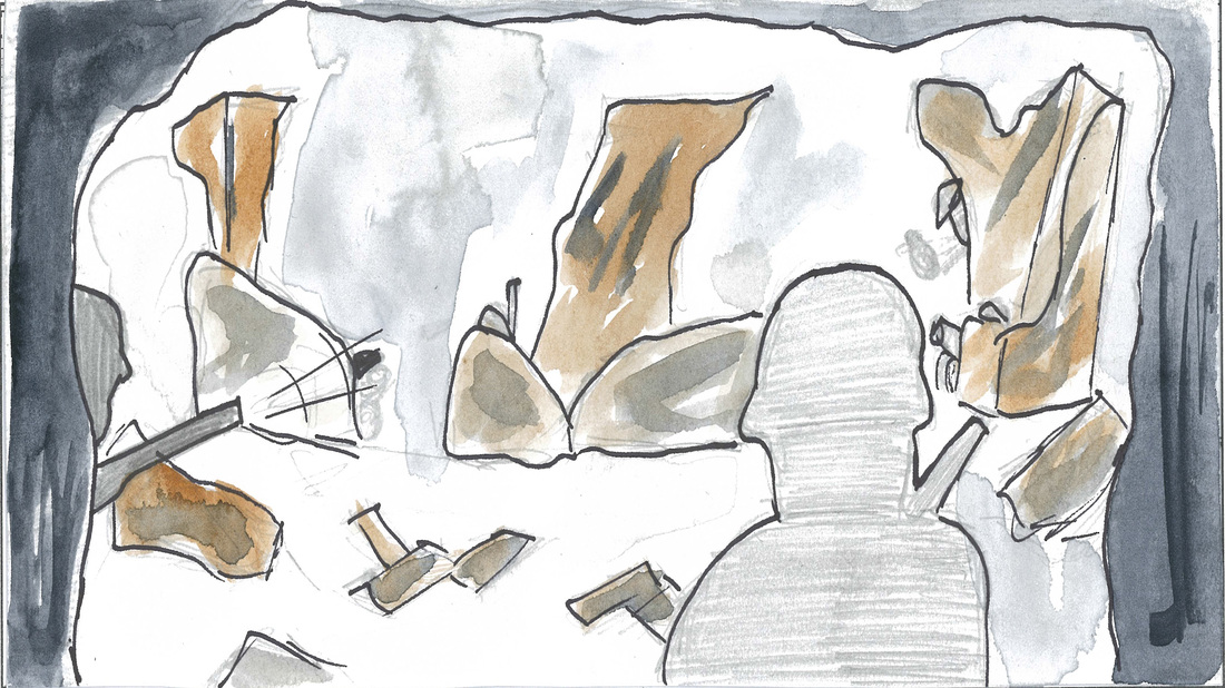
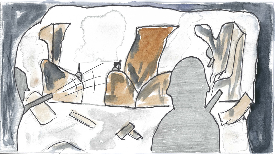
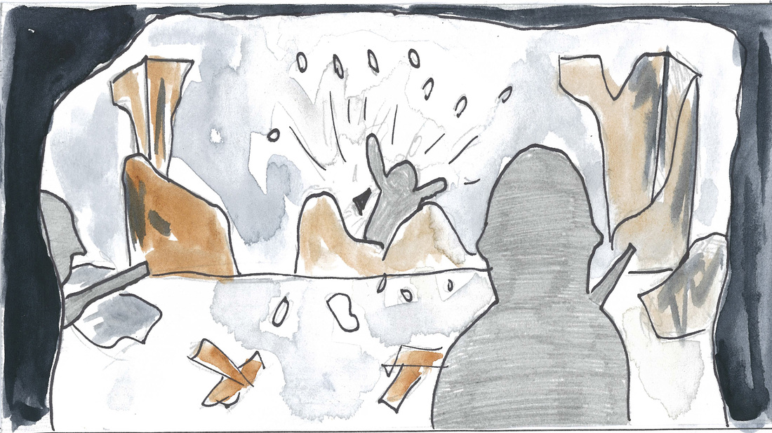
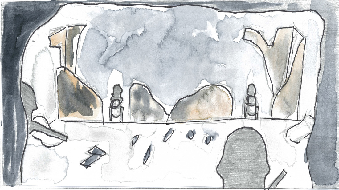
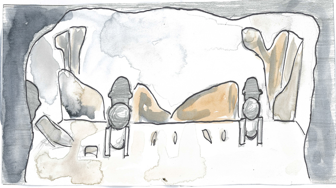
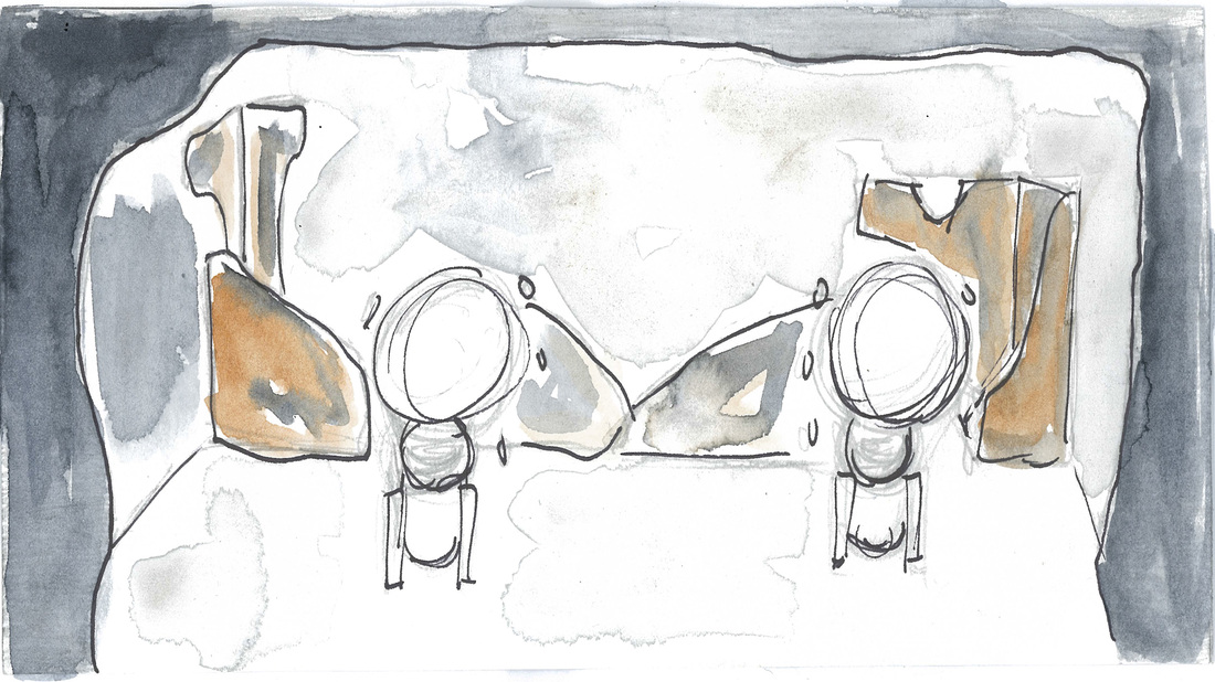
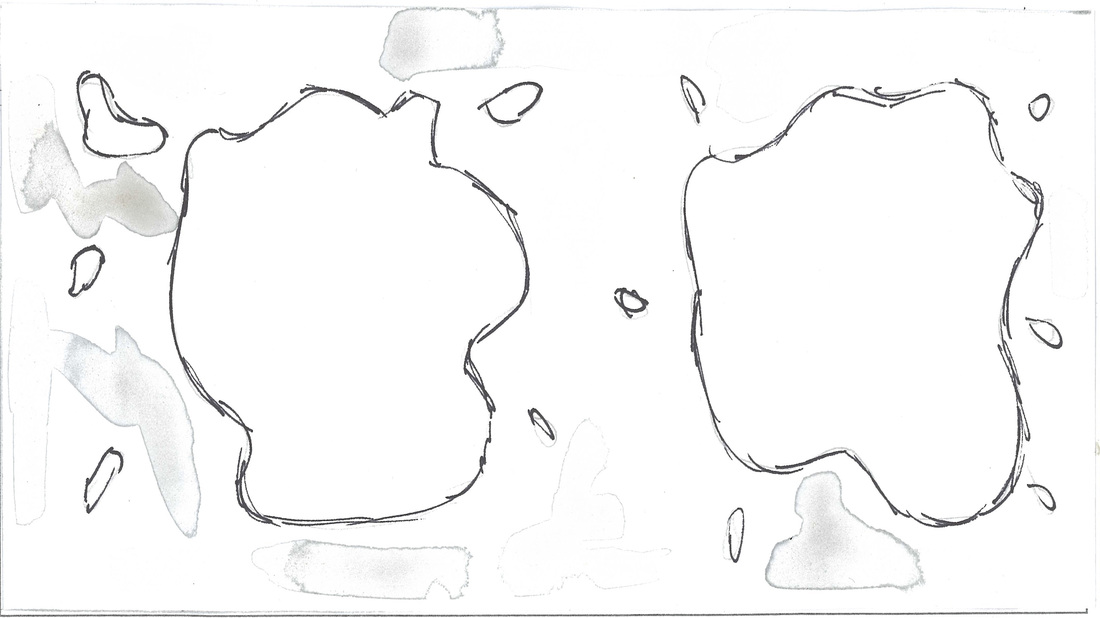
Bellow you will see our story, we as a group discussed that we would like to build a story that continues smooth and not have 3 pieces that don't match well when editing them as a whole story. We also discussed that we don't want blackouts as a transition, we also use one blackout between the ending of the story and the credits part.
storyboard
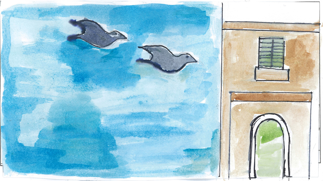
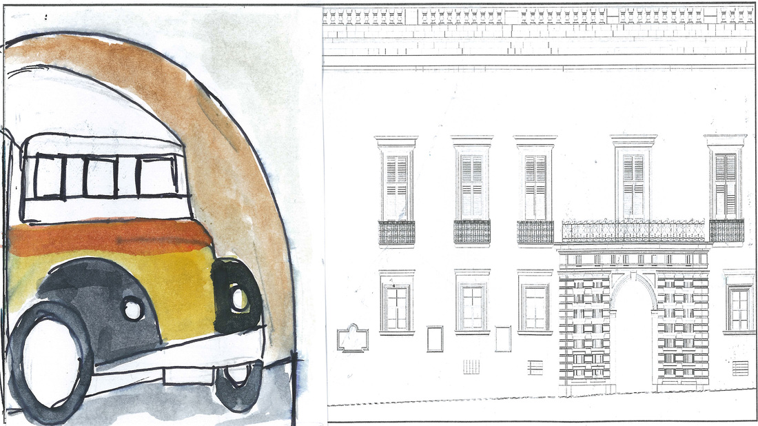
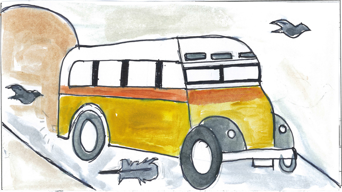
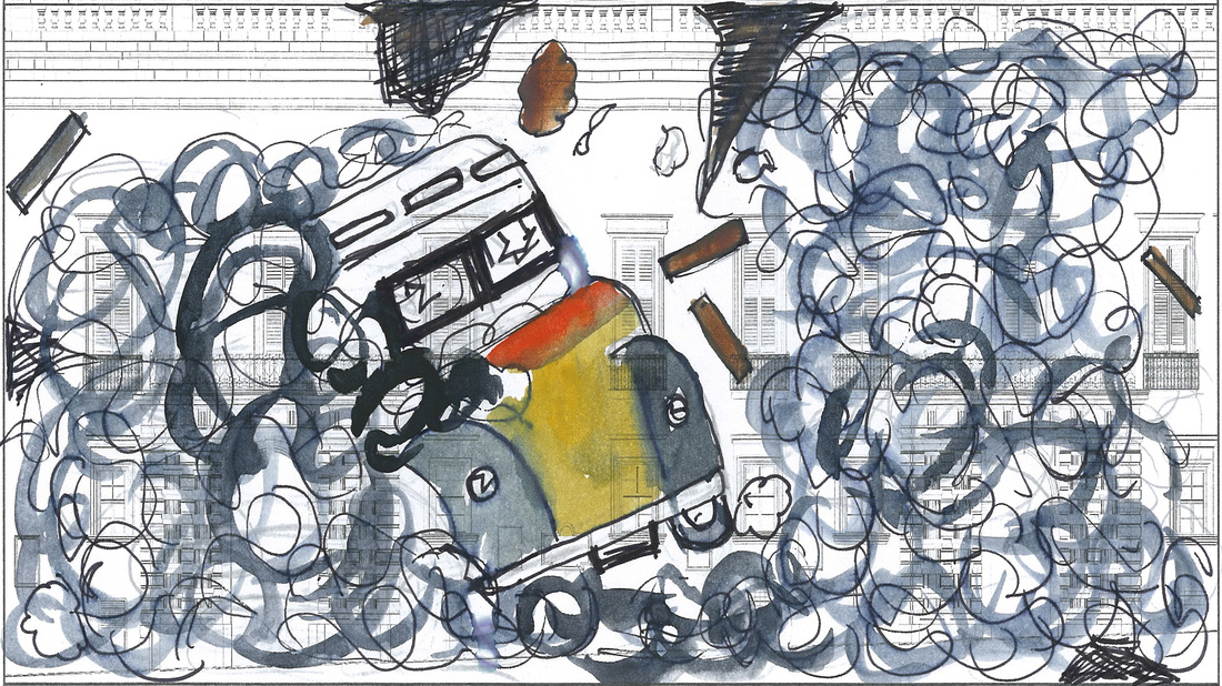
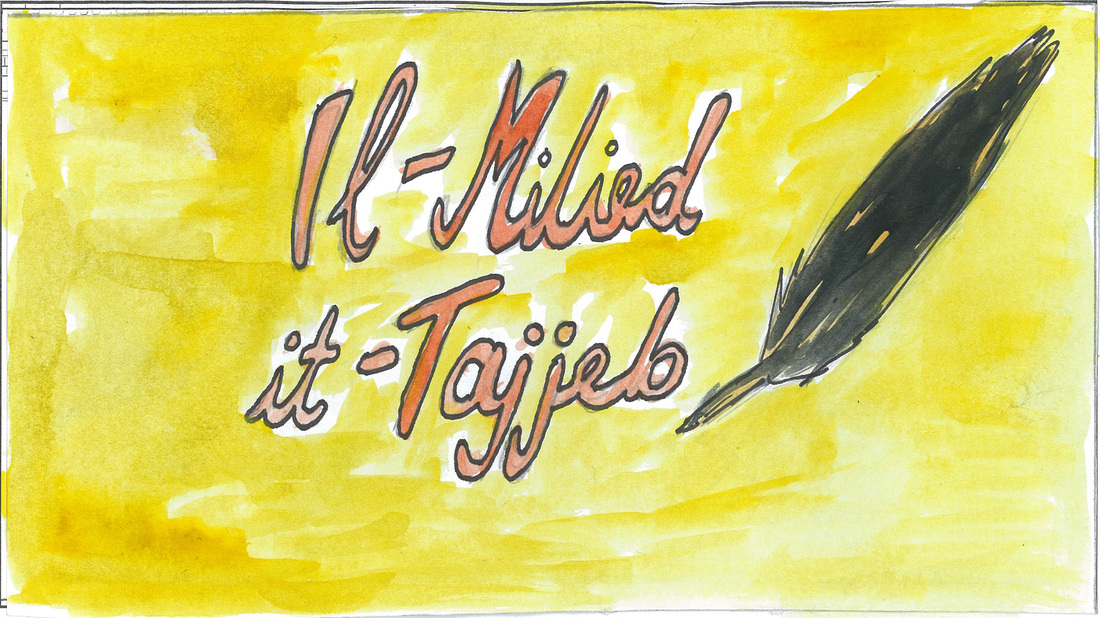
The storyboards where drawn in pencil by; Stef, Lexy and Krysta, then lexy painted them with water colors. When the storyboard was ready I went to a stationery shop to scan them.
Task 1.3 - Documentation
Personal Brainstorming

Ideas for the projection mapping story
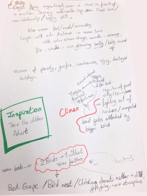
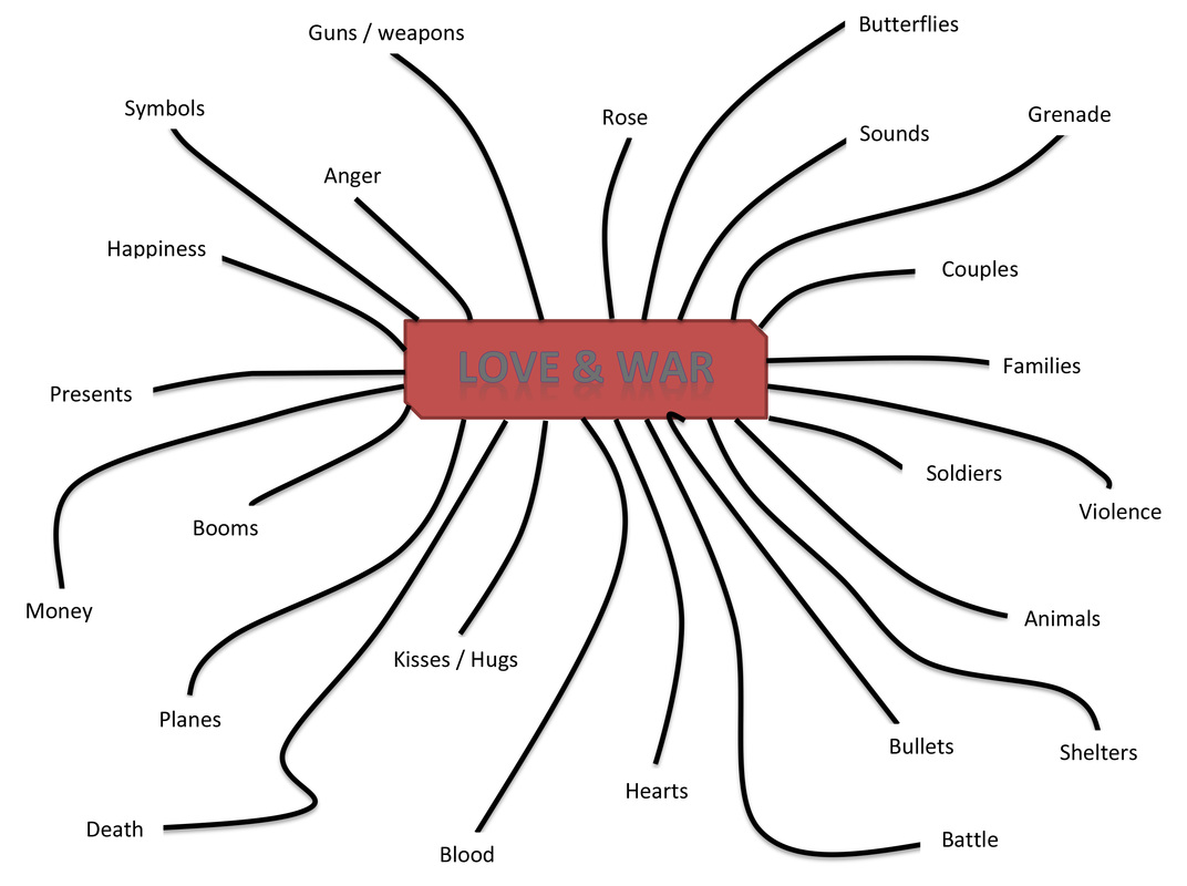
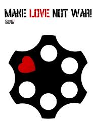
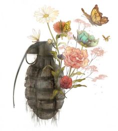
A couple fighting and argument with each other. The boyfriend goes for his pistol that is looked in a safe, then goes near his girlfriend and points the gun at her. He shoots, but instead of a bullet, roses comes out from the barrel of the gun.
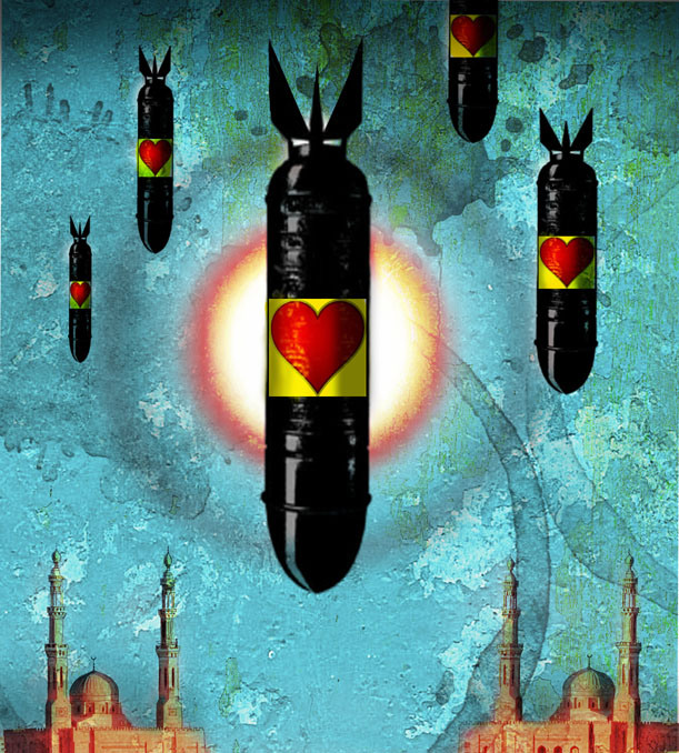
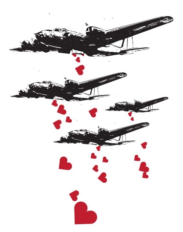
Families are all gathered together in shelters and house. They are terrified and afraid that they are going to die soon. Planes and soldiers are everywhere. Suddenly the planes start throwing down booms, but when the booms hits somewhere , roses, flowers, butterflies and nature things comes out giving the city life back.
A couple fighting and argument with each other. The boyfriend goes for his pistol that is looked in a safe, then goes near his girlfriend and points the gun at her. He shoots, but instead of a bullet, roses comes out from the barrel of the gun.
Families are all gathered together in shelters and house. They are terrified and afraid that they are going to die soon. Planes and soldiers are everywhere. Suddenly the planes start throwing down booms, but when the booms hits somewhere , roses, flowers, butterflies and nature things comes out giving the city life back.
Methods and Principles Used:
Divergence
Transformation
Convergence
Sustained
Articulation
Divergence
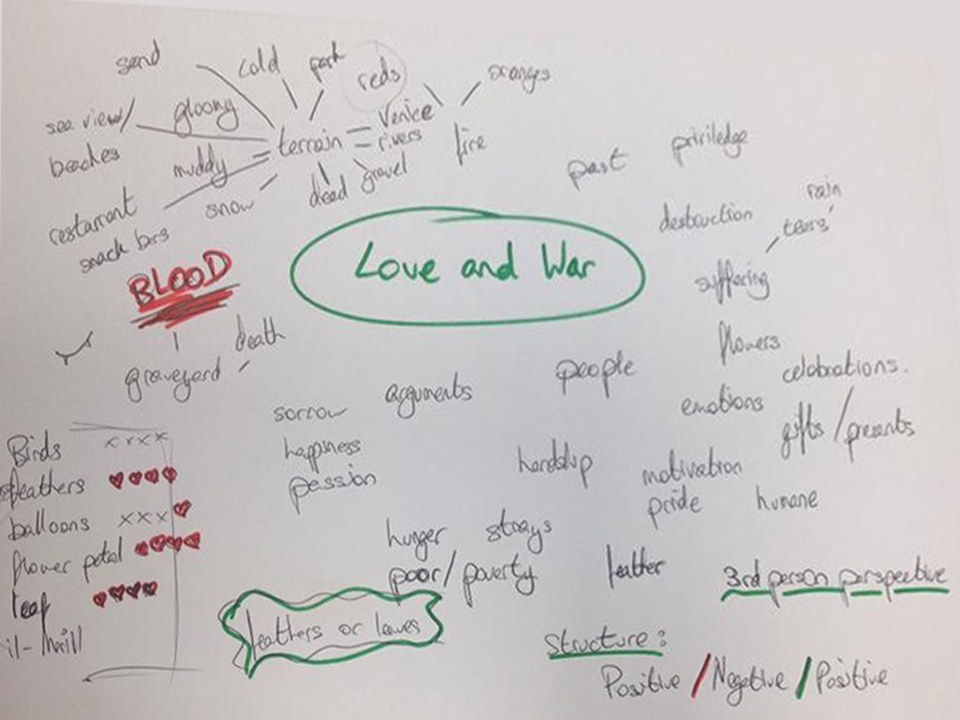
- We started by doing the brainstorming.
- We researched images about war and love to get some ideas.
- I also looked through some Christmas images.
- Showing love elements with the idea of a family value.
- Love through the birds as a couple.
- Importance of peace.
- Unity and tolerance.
Transformation
- Writing the story.
- Sketching for the storyboard.
- Painting the sketches of the storyboard with water colour.
- I went to a stationery to scan the storyboard so that we can have it in digital format.
Convergence
- From the scanned images I have saved each scene as a jpeg image so that I will use them for the animatic part.
- I have created the storyboard as an animatic.
Sustained
- We showed our story idea to the lectures.
- I made some research on what type of sound I should use in the animatic.
Articulation
- I arranged the timing of the animatic.
- I also added different sound affect for our story.
- I have created a small animation for the logo of V18.
- The presentation was also prepared.
- We discussed what each one of us has to say in the presentation.
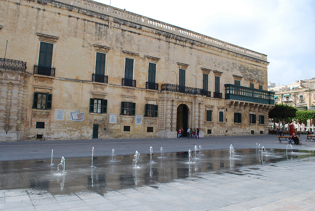
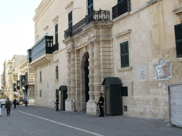
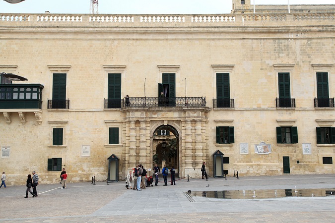
photographic survey
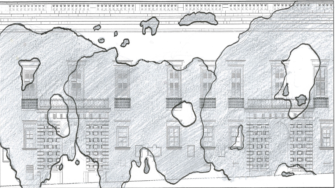
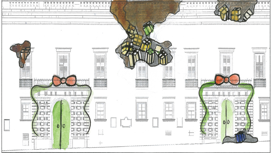
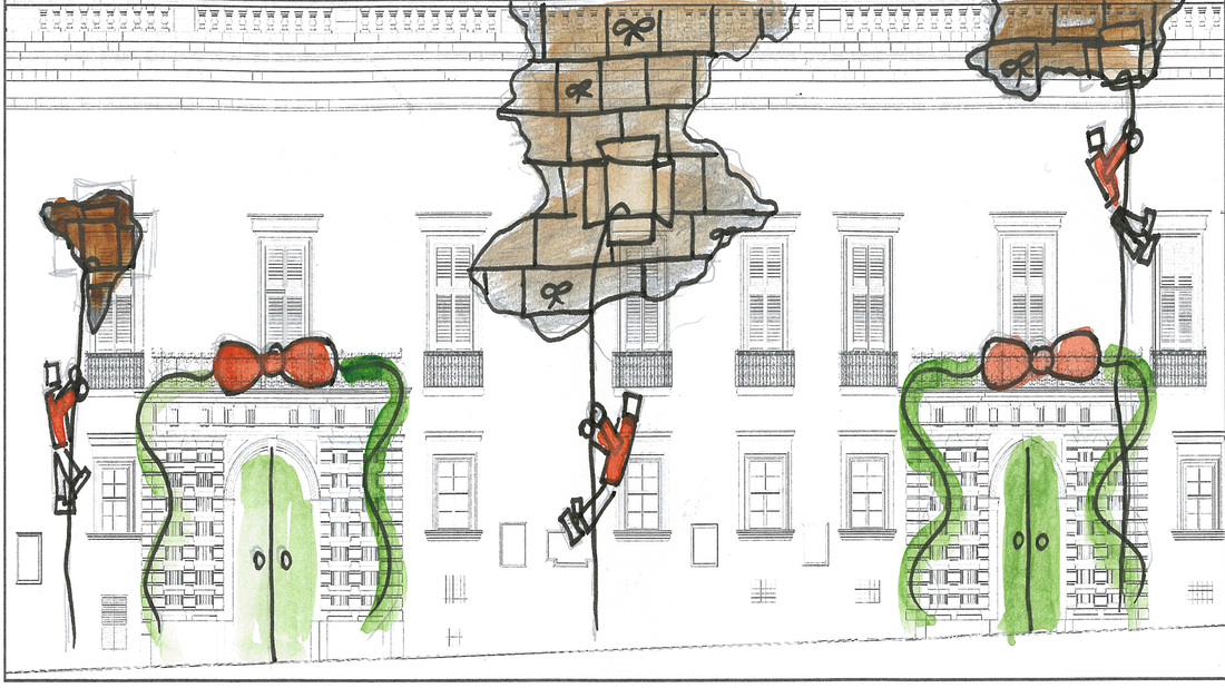
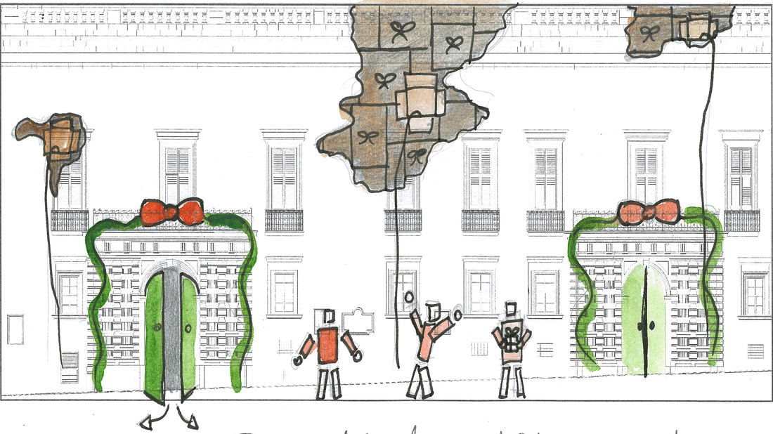
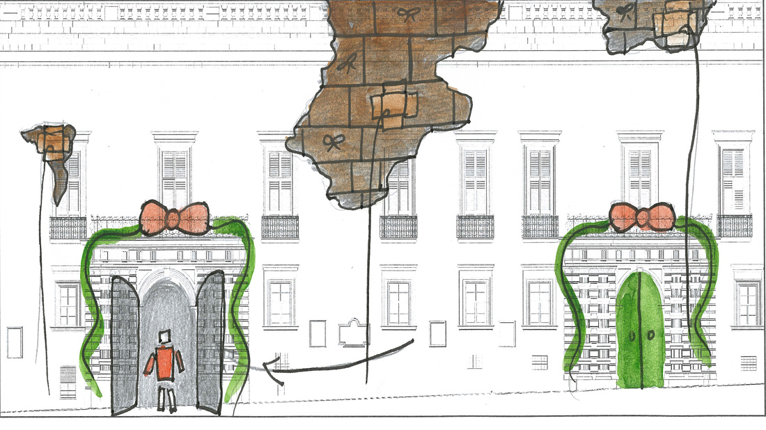
The Grand Master's Palace Valletta is where the projecting mapping will be projected on. When designing we need to keep in mind the space we have available and we also need to know where the windows are. As one can see in these photos there are a lot of windows and other things that we need to take care off.
V18 Logo Animatic
I made the V.18 logo animated, each pieces coming one after the other forming the V.18 logo. For this animated logo I have used Adobe Photoshop.
Storyboard Animatic
My tasks in this group where to create an animated logo and to create the storyboard as an animatic with sound effects. I made the storyboard animated by using the storyboard and by using different sound affects. I have used Adobe After Effect and Adobe Premiere.
task 2 - projection mapping
Departments that I am in:
Production - Organisation
Illustrator
Photoshop
Facebook till the end of the exhibition
Production - Organisation
Illustrator
Photoshop
Facebook till the end of the exhibition
I had to do the net and the paper plane in 2D which I have got the sketch from the concept team. Before I started to work on these objects a meeting from the 2D leaders was held in our class. This meeting was about how we all should work and what we have to do to work the same (example: the size of the brush stroke and how we have to give the shadows). We had compromised to use gradient to our objects to give them more life and look better.
First I made the outline in black then I gave them some color, then I added some shadow and highlight.
First I made the outline in black then I gave them some color, then I added some shadow and highlight.
|
|


|

|
I was asked by Daphne to help with the storyboard, Daphne divided the scenes within the group that was going to design the storyboard in digital. Together we talked on how we where going to work on styles, colors, sizes, etc..
Scenes from the storyboard that I had to draw digital:
Scenes from the storyboard that I had to draw digital:
Divergence method was used in this part, because the story was discussed by Daphne and Christ so that they would tell us how we should work, by setting some methods and rules for the group to follow. Everyone from the group communicated with each other through Facebook chat and school regarding the color used for the characters so that they will all match.The way I worked was that I was getting the screenshot from the animatic from Daphne, then I used Adobe Illustrator or Adobe Photoshop to color them. Daphne had created a folder on the Google Drive for us to upload the scenes when ready from color.
Convergence method was also used in this process, where I have used the colors according to how the concept was drawn. After the coloring I saved each scene as an image (jpeg) and also in .psd format and uploaded them on Google Drive in the folder Daphne Created for us.
Convergence method was also used in this process, where I have used the colors according to how the concept was drawn. After the coloring I saved each scene as an image (jpeg) and also in .psd format and uploaded them on Google Drive in the folder Daphne Created for us.
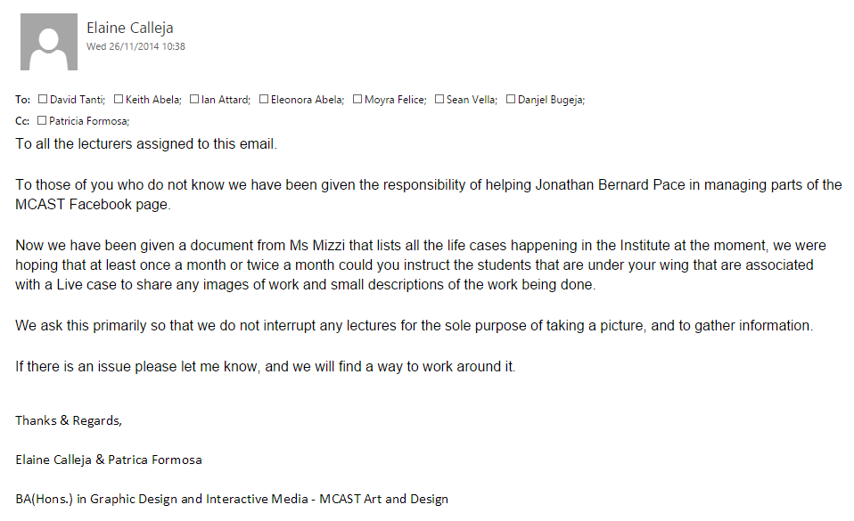
Jonathan have asked the students to help him with the facebook page, and I have spoke with him that I can help. Together with Patricia we are asked to take care the Media course.
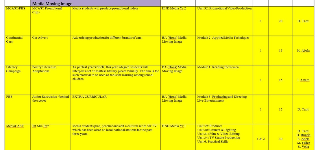
The above table are the live cases that are assigned to me by Jonathan. During this task, I had to get the emails for the above teachers so that I will be able to send them an email. When I get a respond from a teacher I will talk with Jonathan and discuss anything that was said in the email.
Today 26/11/2014 I have sent an email to the teachers that teaches Media the following:
From the above teachers I only got back one feedback. I have already sent them 2 emails with a reminder but still got no answer unfortunately.
I have talked with my teacher Paul Camilleri about this problem that no one is responding to my email. He have told me to send the email again and copy him as well.
I have talked with my teacher Paul Camilleri about this problem that no one is responding to my email. He have told me to send the email again and copy him as well.
|
|
|
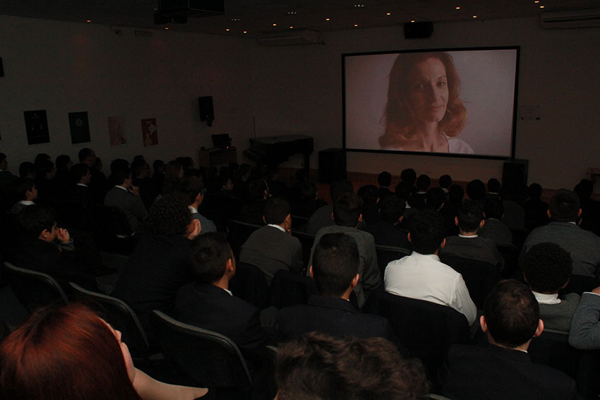
Above are the images that where sent to me by Ian Attard together with a description.
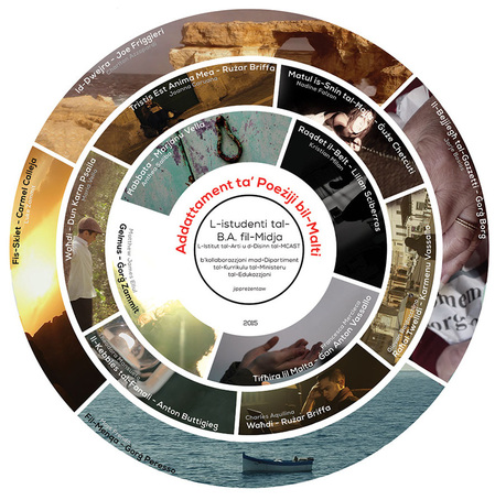
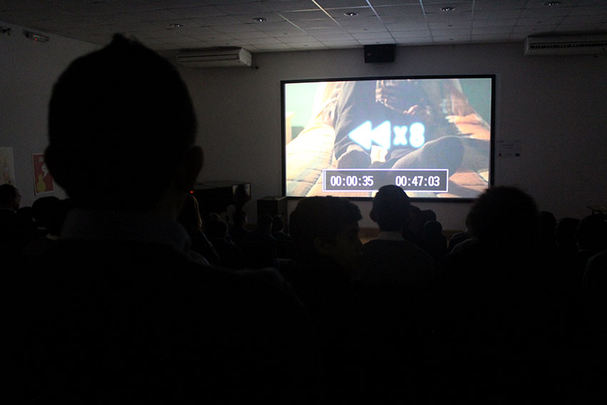
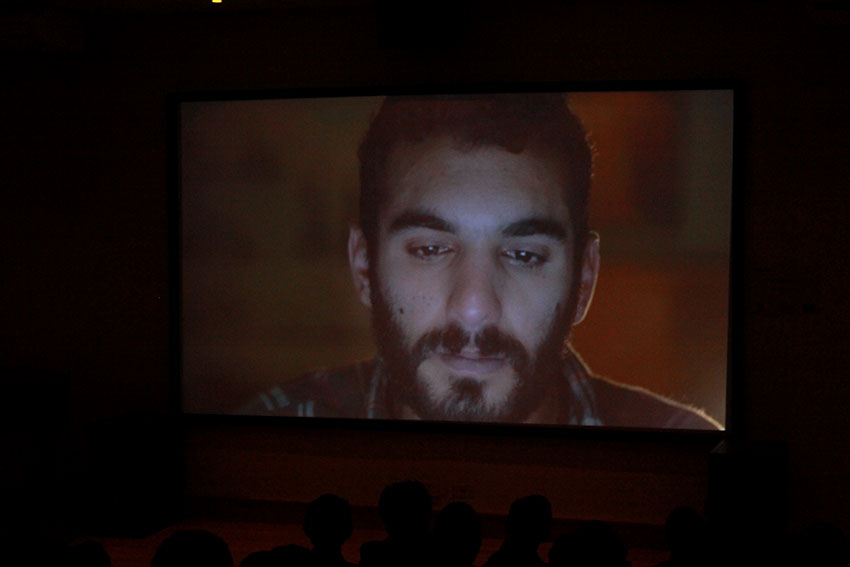
MCAST Institute of Art and Design and The Maltese Section of Curriculum Management Department within the Ministry of Education and Employment are developing a resource of audio/visual work for teaching purposes. This live case gives BA (Hons) Media Moving Image students the opportunity to work closely with tutors and the Ministry to develop a series of short audio/visual projects with the intention of helping students between the age of 11 and 14 to identify more with Maltese literature. Students produced audio/visual adaptations of Maltese classical poetry by using media technology. By giving a visual dimension to flat text on paper the students' productions help Maltese language teachers in Secondary schools to heighten young students’ interest in Maltese poetry. These short audio/visual projects will be available to watch on our Mediacast MT Youtube channel shortly by following this link:
https://www.youtube.com/playlist?list=PLwb0FamE9-z-2HyMQaFTo48Osh4f8ni7n
extra toys
Bellow is the lunch box, which I was asked by the 2D leader for me to design by using Adobe Illustrator. First I sketched a lunch box on the sketch book, then I worked on Illustrator with the outline, then I started giving the lunch box color. I added the text 'Lunch Box' on the front to give it a better look.

The bellow are extra toys that I did myself. The rocking horse and the playmobil look like where designed by the use of Adobe illustrator. The process for these 2D design was divided into 3 steps. The first step was to outline the whole object, then I started to give the object colors and the last step was to give the object some gradient and some shadowing.

|

|
As instructed by Vince I had to make some changes on the rocking horse. The changes where to change the color from black into an other color of my chose and the other one was to give the object some gradient. The changes where done and the bellow image is the final.

New year Countdown Idea
Methods and Principles Used:
Divergence
Transformation
Convergence
Sustained
Articulation
Divergence
- Follow steps for an excellent standard artwork.
- Group of people, but one mind one creation.
- Each group has different guidelines to work with.
- Set of guidelines to work in Adobe Illustrator.
- Different layers for the characters (arms, feet, eyes, etc..)
Transformation
- I opened the sketch in Adobe Illustrator.
- Opened an A4 size canvas.
- Set the setting of the colour to RGB.
Convergence
- I have followed the sketch given to me by outlining the object using the pen tool.
- Then I gave the colours according to the sketch given to me by the concept artist.
- Then I gave some shading to the object by using the gradient tool as instructed.
Sustained
- I checked my work.
- Then I have sent my work to Venice before uploading them on Google Drive to check that everything was being done as they wanted.
Articulation
- I uploaded my work on Google Drive under the folder 2D.
Task 3 - manifesto
A manifesto is a statement of your intentions, which can consist of only a few words or many pages of text. Its scope may be limited to a particular role or period of your life, or include your goals and aspirations for your entire life. Many people find it useful to compose a manifesto, believing that such a document will help guide them in making decisions and keep them focused on their goals.
http://www.wikihow.com/Write-a-Manifesto
http://www.wikihow.com/Write-a-Manifesto
group manifesto
Key points:
1. The And exhibition, is intended to create curiosity in the average person. Curiosity plays a fundamental part in our lives as if we were never curious about what goes on around us. The word progress would technically explain to that without curiosity, people all around world would have never become what they are today.
Why do people become curious? We all wish to satisfy this curiosity just like in the proverb "curiosity killed the cat where it may incidentally get itself injured or killed due to it being so curious". The same goes for humanity as if we were not curious.
While we satisfy our curiosity, we learn and we also become enlightened and stronger.
2. In terms of design, we are constantly curious about what are we going to create to keep all the visitors curious. At the best of times, unknowingly, satisfy ourselves with what we create. Good design should always save a sense of pleasure not just to the client and the users, but also to the creators.
When taking into consideration elements of design such as functionality, depending on the context of this word functionality, always speaks towards the user whether it's a designed chair or a piece of typography both have their uses, whether one provides comfort in a physical form and others can provide comfort in their thoughts. Either way, good design should always leave you thinking about what's going through the mind of the person who created this work and that is where this point 'Curiosity' takes control.
As designers we say to ourselves that we require many elements to produce any kind of work, whether it is graphic design, 3D design or just fashion. We say to ourselves that we require a theme, we require inspiration, we need visual aids and all this can be true. The intention of the work is the most important piece of information that we all require but it is by far one key point that many of us neglect to mention. Without an intention, what ever is designed will technically have no purpose.
3. In the case of keeping things interesting and entertaining, one of the key aspects that should always be present is the meaning and intention of the work. i.e. something that attracts curiosity, this can be done with elements based on the five senses but this is dependent completely on the work in question.
Manifesto
1. The And exhibition, is intended to create curiosity in the average person. Curiosity plays a fundamental part in our lives as if we were never curious about what goes on around us. The word progress would technically explain to that without curiosity, people all around world would have never become what they are today.
Why do people become curious? We all wish to satisfy this curiosity just like in the proverb "curiosity killed the cat where it may incidentally get itself injured or killed due to it being so curious". The same goes for humanity as if we were not curious.
While we satisfy our curiosity, we learn and we also become enlightened and stronger.
2. In terms of design, we are constantly curious about what are we going to create to keep all the visitors curious. At the best of times, unknowingly, satisfy ourselves with what we create. Good design should always save a sense of pleasure not just to the client and the users, but also to the creators.
When taking into consideration elements of design such as functionality, depending on the context of this word functionality, always speaks towards the user whether it's a designed chair or a piece of typography both have their uses, whether one provides comfort in a physical form and others can provide comfort in their thoughts. Either way, good design should always leave you thinking about what's going through the mind of the person who created this work and that is where this point 'Curiosity' takes control.
As designers we say to ourselves that we require many elements to produce any kind of work, whether it is graphic design, 3D design or just fashion. We say to ourselves that we require a theme, we require inspiration, we need visual aids and all this can be true. The intention of the work is the most important piece of information that we all require but it is by far one key point that many of us neglect to mention. Without an intention, what ever is designed will technically have no purpose.
3. In the case of keeping things interesting and entertaining, one of the key aspects that should always be present is the meaning and intention of the work. i.e. something that attracts curiosity, this can be done with elements based on the five senses but this is dependent completely on the work in question.
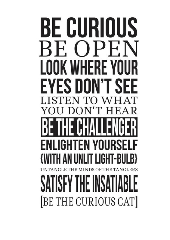
Manifesto
- Be Curious
- Be Open
- Look where your eyes don’t see
- Listen to what you don’t hear
- Enlighten yourself with an unlit lightbulb.
- Be the challenger
- be the curious cat
- untangle the minds of the tanglers
- Satisfy the insatiable.
- In a moment, one can leap into the unknown with the full satisfaction of not knowing.
This video shows basically how our installation is to be created.For this installation we need: a wooden frame, mirror, glass, silver tint and LED light.
For the manifesto installation we need to buy silver tinted, Jonathan told me to take care to buy silver tint from somewhere. First I went to check the price from Falcar in Mosta, then I went to two more shop to try and find cheaper and maybe someone will have about 1meter instead of a roll cause we needed about 70cm but they told me that silver tint is not being used any more. I also have sent a message on Facebook to two more shops but got no answer from them. Then I had to go and buy it from Falcar cause there I found available.
Manifesto Feedback
Today the 27th of January together with Johnathan and Claude we went to get some feedback about our manifesto from students at school. About 21 students gave as there feedback. Although I was very shy to ask people to come and tell us what they think about our installation I have still managed to ask some people to tells us there feedback. We have asked to them, what they do think about it? On whole we have got more positive feedback about the installation. The effect of this installation brought them more curiosity the way how it was designed and the tunnel effect. Some of the negative feedback's where that the reflection of themselves in-front of this mirror was distracting them, the notice board at the back also was distracting them as this was being shown from the mirror, and one person told us that the light should have been yellow instead of bright white.
Today the 27th of January together with Johnathan and Claude we went to get some feedback about our manifesto from students at school. About 21 students gave as there feedback. Although I was very shy to ask people to come and tell us what they think about our installation I have still managed to ask some people to tells us there feedback. We have asked to them, what they do think about it? On whole we have got more positive feedback about the installation. The effect of this installation brought them more curiosity the way how it was designed and the tunnel effect. Some of the negative feedback's where that the reflection of themselves in-front of this mirror was distracting them, the notice board at the back also was distracting them as this was being shown from the mirror, and one person told us that the light should have been yellow instead of bright white.
Designing for the 5 senses
HEXENSE is a multi-sensory experience kiosk using holographic and haptic technology. The six screens represent each of the six senses. Although there are many more senses, the six senses most noteworthy are:
The six senses addressed by Hexense kiosk are:
Visual (sight)
Auditory (sound)
Olfactory (smell)
Tactile (touch)
Gustatory (taste_
Kinesthetic (position / movement)
The user is able to experience a high level of engagement, with the immersive holographic kiosk and the haptic Feelscreen technology by Senseg.
http://www.prattdigital.org/future-interfaces-nyc-media-lab-presentation/
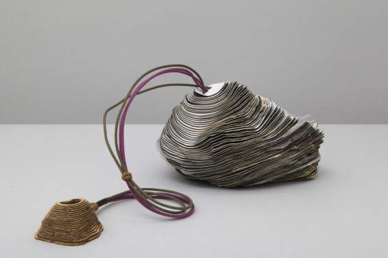
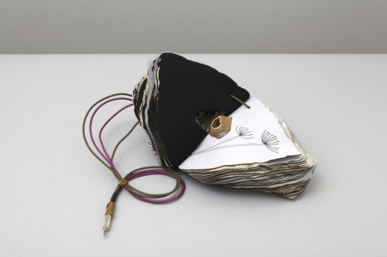
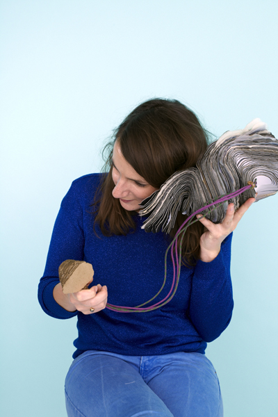
Earthy Concept Item Engages All Five Senses
Central Saint Martins MA candidates Anita Silva and Leslie Borg designed an incredibly creative interactive product for Icelandair entitled “_scape”. Inspired by a rock found in Iceland, _scape is a layered “book” containing “sounds, visuals, textures, scents and tastes” which can serve as a reminder of Iceland itself, or just a general internal escape. Intended to evoke lava rock and ice (two strong elements of the Icelandic landscape), the object is earthy-looking, meant to strongly contrast with the sterile environment of an airplane cabin.
http://beautifuldecay.com/2012/08/06/earthy-concept-item-engages-all-five-senses/


our kinetoscope model using 3 senses


The above images show a kinetoscope model which we can build to advertise the school end of year exhibition. this can be placed in public places outside the school for people to see and visit our exhibition.
Divergence was used here as the idea was of Christ and Jonathan, then Jonathan had explained to us how this would work. The idea uses 3 senses: seeing, sound and touching.
The words written on the kinetoscope 'Come Look Know' will make people curious and they will look through to lens to see whats inside this box. We can show behind the scenes of the exhibition preparations, how the exhibition is being prepared and also group course trailers. Sound can be played in the background to make people more curious. This works when a person rolls the handle, then the person sees the video from the scope. When the person stops rolling the handle the video will stop as-well.
Presentation Day
As a group we have discussed which slides each one of us has to talk about for the presentation day from about a week before. Then each of us had planned what to say during the presentation and discussed them with Jonathan to see if we where saying everything. In the morning the day of the presentation we have made one last practice before the presentation in the hall. I did really good because I know what I had to say and I was prepared even Jonathan said that I did well. Unfortunately I felt that I did not go well in the hall presentation because I was prepared to speak in Maltese then they told us to speak in English. I am not an English speaking person and I also have stage fright when presenting something in front of others.
As a group we have discussed which slides each one of us has to talk about for the presentation day from about a week before. Then each of us had planned what to say during the presentation and discussed them with Jonathan to see if we where saying everything. In the morning the day of the presentation we have made one last practice before the presentation in the hall. I did really good because I know what I had to say and I was prepared even Jonathan said that I did well. Unfortunately I felt that I did not go well in the hall presentation because I was prepared to speak in Maltese then they told us to speak in English. I am not an English speaking person and I also have stage fright when presenting something in front of others.
Evaluation
When the brief was given to us in October, I started by reading the brief to get a clear picture of what I have to do. The first task was to research about other projection mapping that have already been shown. I went on YouTube and wrote architecture projection mapping and saw quite a few videos there. I have seen videos more than I have written about in the blogs. When watching and making research about something that you have to create you will gain many ideas and experience things that have been used already.
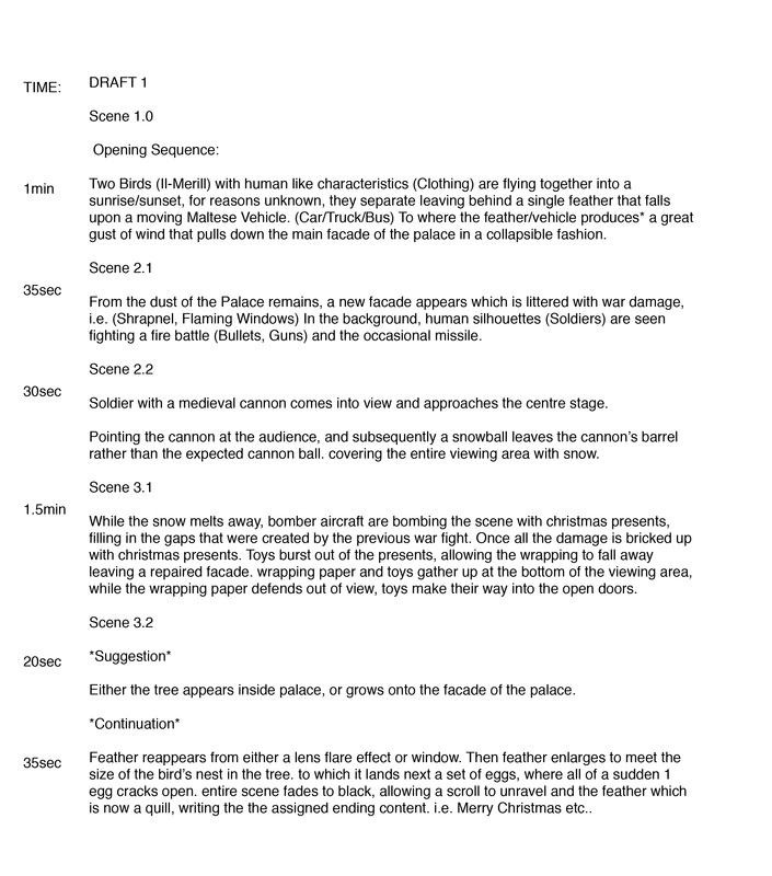
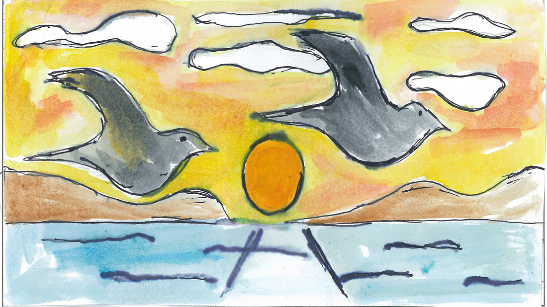
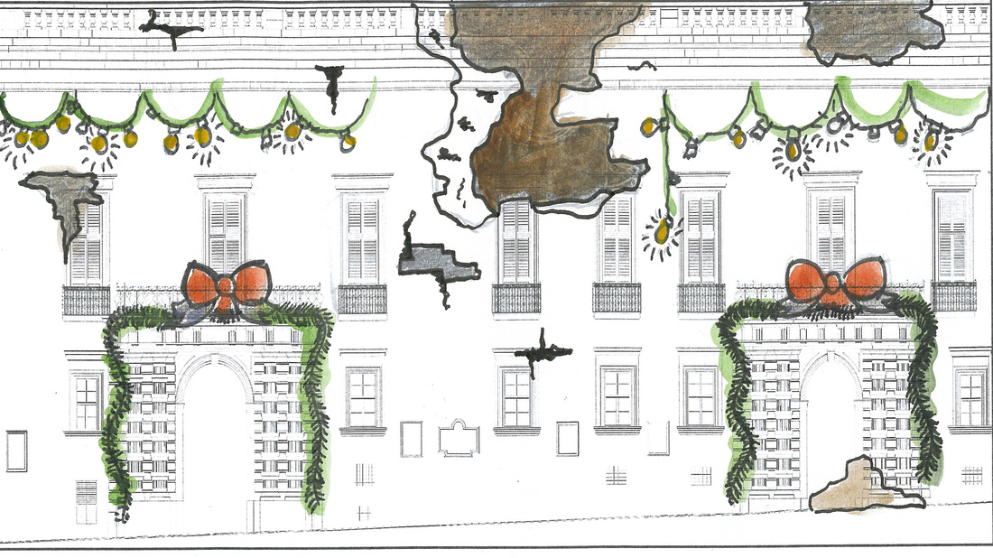
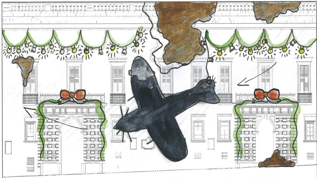
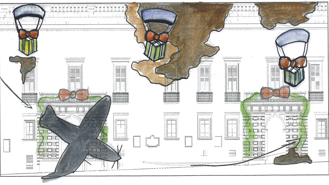
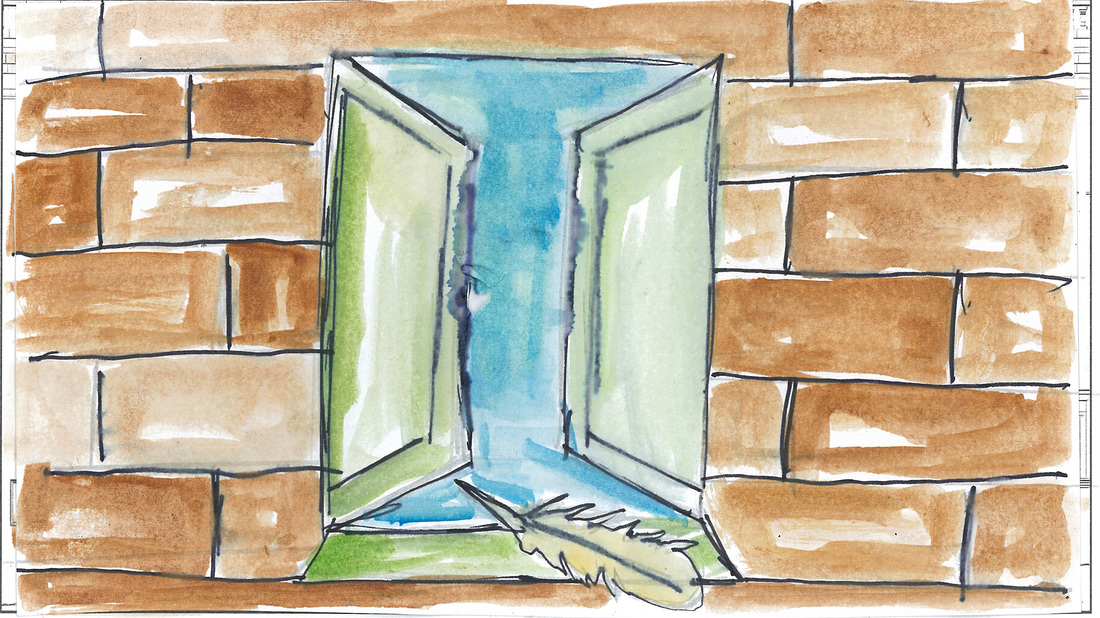
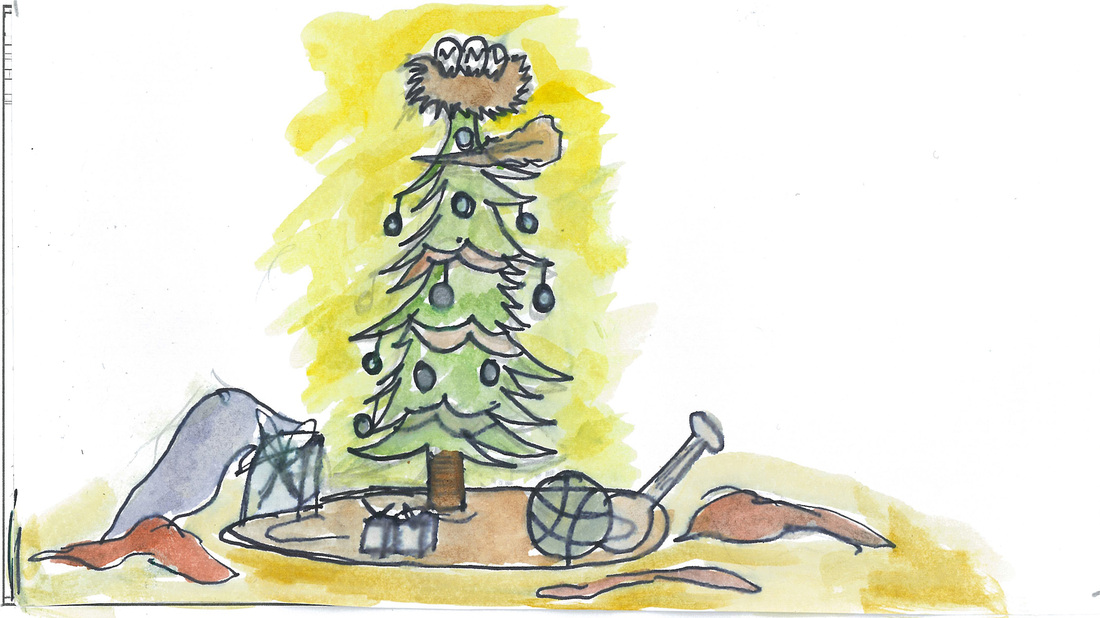
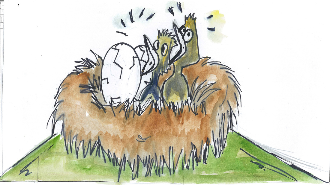
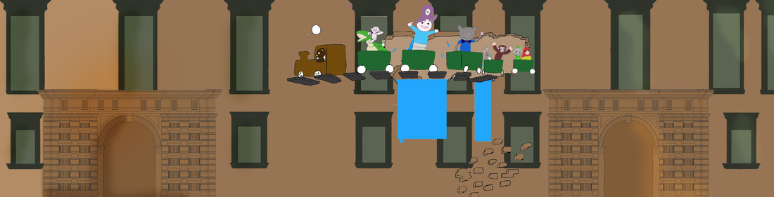
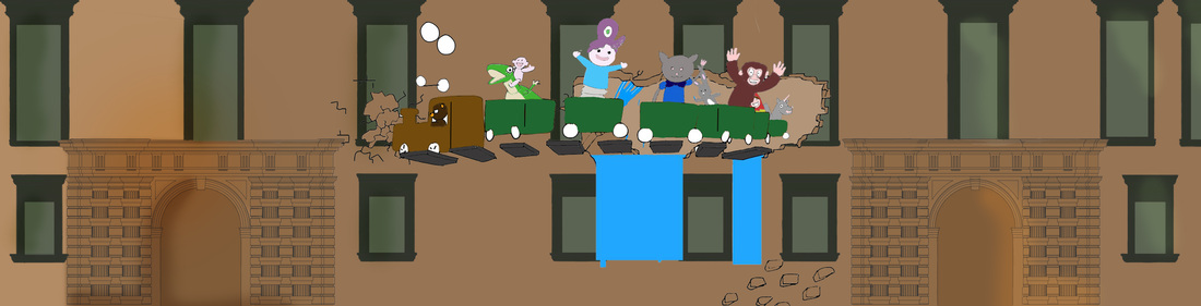
The first group for this assignment was for the projection mapping story. The members of the group that I was in with where: Lexy Sant Manduca, Stef Spiteri, Krysta Maria Micallef and Jonathan Bernard Pace. The theme for this year projection mapping was love and war. As a group we started by brainstorming those two words by writing down every word that comes in mind. We also researched for images to get more inspiration before writing the story. Again as a group we had discussed what we wanted and what we did not want in our story. Then from all the brainstorming and inspirations each of us found we started by writing down the script of the story. We wanted to come up with a story that is very flowing. We used a feather as an object that will show the journey throughout the story. When the script was ready we have assigned roles to each members. Krysta, Stef and Lexy sketched the storyboard. After Lexy painted the storyboard with water colour. Stef had created a logo design for our team. Lexi, Stef and Krysta also took care of the design for the book we gave during the presentation. I had the role to create the storyboard animatic, also applying sound affect to the animatic so that people would understand more what is happening in the story. I have also created the V18 logo animation. Then Jonathan took care the presentation design and information.
Once we got the news of which projection mapping story was chosen by the V18 members, the lectures discussed with each other of how the students would be split in different departments. Once the groups where ready and each student knew in which group he/she was we all started working. Each group had different work to handle. The group of concept artist was the first to start working, when all the toys where drawn then they decided together which toys where to be created in 3D and in 2D. Each group leader organized a meeting with the members of the group to clear things out and tell us what we have to use to work all the same. In some point during the process I felt that there was a lack of communication within the students. Also I thing that some students have taken the lead to lead things out, feeling that they know everything. Joseph Cohen had created the Google Drive folder and gave excess to every student, so that each one of us will upload his work when it is done. Finally the day had come where all the students together with our teachers projected the projection mapping on the Grand Master's Palace Valletta. This was surely a great experience for children and adults watching the projection and I also felt proud that I was part in this year projection mapping.
Another group was formed to work on the concept for the end of year school exhibition. The group members that I was in with where: Jonathan Bernard Pace, Claude Taliana, Anton Micallef and Christ Scicluna. The tasks we had was to come up with a manifesto and also a way how to advertise our exhibition by using at least two from the five senses. For the installation of the manifesto we decided to create an infinity mirror to create curiosity in people passing by it. We have decided to install this mirror in the main corridor next to the canteen because many students pass there. I together with Claude and Jonathan took care in buying the things we needed to create this mirror. After the installation myself together with Jonathan and Claude we went to gather some feedback about the installation from students at school. Jonathan and Christ came up with the idea of using a kinetoscope which people can look through the scope and watch a video. This concept design will use three different senses which are: seeing, hearing and touch.
I feel that we had some lack of communication within this group regarding the date and time we had to place the installation. Another think is that during the presentation I haven't explained myself well in English because I was prepared to speak in Maltese. I feel that I gave my 100% input in this group and I have always asked if there is anything else that I can help with. I have also offered to help Jonathan with building up the mirror but he had explained that it's a one person job.
From this assignment I have learned what design methodologies and design principles are. I have also worked with people that I haven't knew before which was a great experience working with them.
